
I’ve waited a long time for a single sensor Varicam, and it looks like that wait may be coming to an end. But is it everything I want it to be? A look at Panasonic’s latest demo material says “Maybe yes, maybe no…”
First, if you haven’t seen Panasonic’s Varicam 35 demo reel, take a look:
There was a time, in the early 2000’s, when Panasonic ruled the world. At that time the EFP production and broadcast worlds were split between Sony and Ikegami: the Sony look was much derided as being too warm and saccharine, with orange reds and an inability to render secondary colors like cyan accurately, while Ikegami was applauded for its neutral color palette and natural flesh tones. Owner/operators tended to buy Ikegami cameras because they liked the look; rental houses bought Sony cameras because turnaround on camera repairs was really fast.
In other words, if you were a DP with a good eye who owned your own camera you were more likely to buy Ikegami because they looked great. If you were a rental house you bought Sony because their service and repair department was excellent.
Panasonic swooped into this environment with the SDX900, an SD camcorder with built-in 3:2 pull down that emulated film stutter directly on 59.94i video and whose color was to die for. Flesh tones were lush and rich, and secondary colors, long a problem with Sony cameras and slightly less so with Ikegami cameras, were surprisingly subtle, accurate and gorgeous. A Sony camera would often render a cyan object as simple blue, while a Panasonic camera would show it as actual cyan. Sony reds were orange; Panasonic reds were solidly red. (Panasonic still had issues with super saturated “candy apple” reds, but still… they were way more accurate than Sony’s.)
This color science transferred over to the original 720p Varicams, which were much favored by owner/operators because of the Panasonic look. For quite a long time Sony’s 1080p F900 and Panasonic’s 720p Varicam were competing neck-and-neck, and resolution difference almost didn’t matter: what was more important was whether you liked Sony color or Panasonic color, and whether you could sell your clients on that look. Gradually, though, it became clear that the 720p format was losing out to 1080p production, and when Panasonic stumbled in quickly getting a 1080p Varicam to market Sony took the lead and never looked back.
By the time Panasonic released their first 1080p Varicams we were well down the single sensor road. Three-chip cameras were old news; no one wanted to shoot episodic television, features or spots on three-chip “broadcast” cameras anymore. RED kicked the major manufacturers in the asses by giving us an affordable single sensor high-resolution camera, and as those manufacturers responded Panasonic was left hopelessly in the dust.
Many of us remembered that Panasonic look, though, and the desire for it has never really gone away. Panasonic’s first attempt at a dedicated cine-only single sensor camera, the AF-100, flew off the shelves sight unseen because of this reputation, but most were quickly returned when buyers learned that it was a complete turkey of a camera with horrible highlight handling, lousy dynamic range, and 8-bit processing that resulted in visible banding when the camera saw sky or any kind of flat field. The stills division found a niche with the GH series of cameras, but the motion imaging division seemed to have hit a brick wall.
Until now…
My greatest concern is that Panasonic is still making broadcast cameras. I worry that they are playing to video’s greatest strengths–bright, saturated colors, and especially saturated highlights–and that they’ve missed the revolution toward subtle beauty brought about by the Arri Alexa and its extremely successful emulation of the best aspects of film. Even Sony has jumped on this bandwagon with SGamut3.cine and the LC709 Type A LUT built into F5 and F55 cameras (and available as a cube LUT for external color grading apps). Crazy saturated highlights just aren’t in style for U.S. and European-based drama and advertising work, and I’m not sure Panasonic has gotten that memo.
Let’s look at some images and see if we can define the Panasonic look:
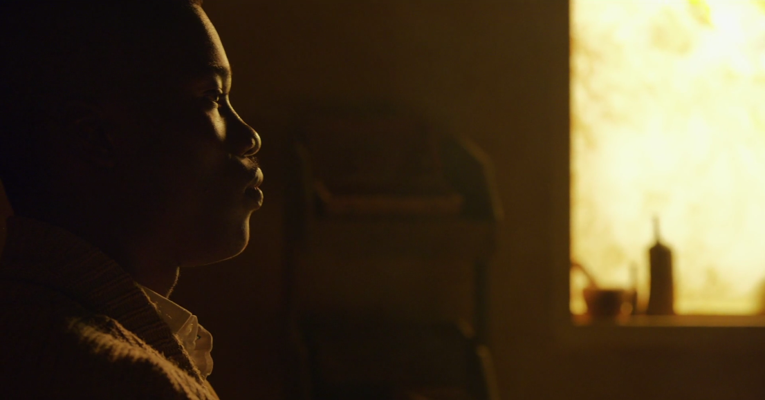
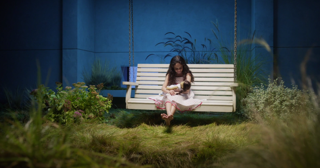
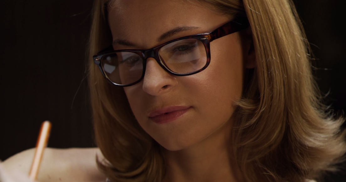 This is the basis of the Panasonic look. There’s something about their flesh tones that just jump off the screen. They’re warm and lush and alive. Some might say they’re a little too alive, but I think there’s a place for this kind of richness out in the world. Obviously there’s a little bit of warmth in the light hitting her face, but still… rich flesh tones are very much what Panasonic cameras are known for.
The last time I used Panasonic cameras was for a series of cooking show-style commercials shot on two HDX-900s. In an otherwise stark white kitchen the host’s flesh tones looked spectacular, as if she was part of a moving watercolor painting. Panasonic does something to skin that no one else does.
Note how this actress’s flesh tone is a little bit is a whisper on the yellow side, although not terribly so. This is going to become a theme as we move forward: Panasonic cameras do yellow really, really well. Sometimes this is good… sometimes, not so good.
Here’s where it works well. The yellow in the sky around the sun reminds of me of Hudson River School landscapes. It’s quite beautiful in this context, and I’m not sure I know of any other camera that can render a bright yellow of that purity. A Sony F55, using the SGamut3.cine color space, might be able to pull this off.
I believe it was this year’s Academy Awards Ceremonies that used an array of dimmed skypans as a background for some of the show. They were dimmed so low that they turned this hue of yellow, and I immediately recognized that Panasonic broadcast camera look.
I’ve learned from experience, however, that it’s easy for very warm hues in Rec 709 to perceptually “tip over” into greenish hues. Orange and yellow are, after all, simply red mixed with various amounts of green, and at some point–depending on the color space, visual perception, relationship to other colors in the scene, or limitations of the capture and display mediums–green takes over. There are situations where green looks great, but others where it really doesn’t work well at all.
I’m very wary of working too close to this color in digital as it’s a fine line between a sunset and a “green flash.”

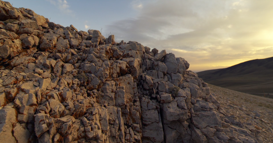
This image is a great example. The highlight on that rock at the left of frame has a lot of green in it: I would expect it to be reddish yellow but it looks greenish yellow here. When I examine that highlight with a color picker (I use Art Director’s Toolkit for this kind of thing) the hue comes up as 242, 228, 162 in RGB. That’s the reddish side of yellow, but that rock still looks too green to me. Maybe the fact that it’s so bright makes it appear more green to my eye.
I use a color picker just in case my NEC display isn’t perfectly calibrated. NEC tends to be pretty good with color, and this monitor came from the factory with paperwork showing that it had been calibrated properly to respectable specs. Still, before calling out a manufacturer on a color issue I like to be fairly sure of what I’m seeing. The color picker gives me the objective RGB values inherent in the material, and I can use those numbers to confirm or deny what I think I’m seeing by eye.
Most cameras will desaturate highlights to avoid color distortions as color channels clip. The fact that red is reading at 242 out of 255 tells me that the luma channel in this image is pretty close to clipping, and one or more color channels may already be clipping. Luma and chroma are two different things in HD, and it’s possible to clip a color channel without clipping luma.
Luma is the gamma-corrected brightness channel, and in Rec 709 it is determined by adding together percentages of the signal strengths in each color channel: red is 21% of the luma value, green is 71%, and blue is 7% (roughly). As red is only 21% of the luma signal it may not have enough impact on the luma waveform to show clipping, but parade RGB may show red as being completely topped out. Once red hits the ceiling the other colors are free to increase in saturation. In this case, if red clipped and green increased in exposure, the ratio between the two becomes skewed and the hue shifts toward green.
I don’t know for sure that this is the case, but that rock on the left side of frame really doesn’t look right to me. Generally cameras will desaturate highlights once they cross a threshold–usually 70% luma, as that’s the point where the green channel would clip if it reached full saturation–but Varicam doesn’t seem to do this.
It’s possible, though, that since this footage was presumably captured in some sort of log or raw format, the rock appeared a beautiful sunny yellow in a grading suite on a really high-end monitor, or in a DI room, and it just looks a little too green on an SRGB or consumer Rec 709 screen. Or maybe I’m the only one who sees that rock as a little too green.
I tried to view this reel on Vimeo through my Apple TV, which is hooked up to a Samsung HD monitor, to see how the color looked on a dedicated Rec 709 consumer monitor, but it doesn’t appear to be available through that channel. I also scrolled through a number of color profiles on my display to see if any of them shifted that rock away from green, and none did.
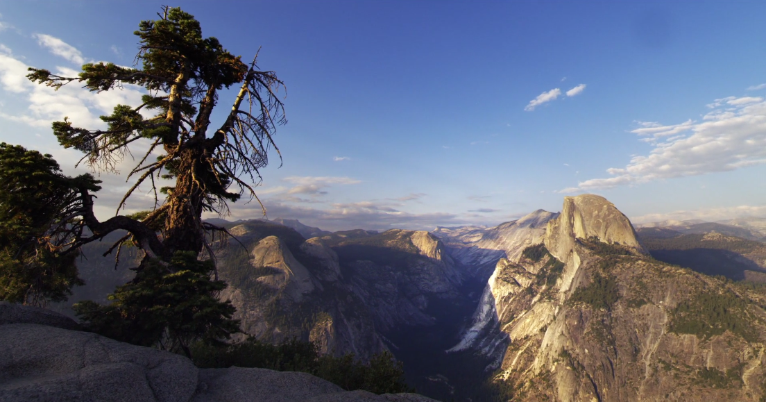
Here’s a shot where that same yellow color looks great. This really does look like a painting out of the Hudson River School. The golden light on the rocks is a color that I don’t remember seeing out of any other camera. It’s quite lovely. Maybe the way Panasonic cameras punch up yellow is the secret to their gorgeous flesh tones.
This scene bothers the heck out of me. It just plain looks GREEN. Well, greenish yellow anyway. This reminds me of the look I get when using CTS (color temperature straw) gel to emulate sodium vapor lighting for night exteriors. The intent here seems to be to use CTS to emulate sunlight, but to my eye this could pass for a night interior shot next to a brightly-lit parking lot.
This is the angle that really worries me. That window looks awful, but not because it’s clipped as I’d expect that in a brightly lit window. What bothers me is how the camera seems not to roll off saturation or exposure as the color channels approach clipping. This is a classic “video” look, and I really don’t like it.
In an age where we have Alexa, whose desaturated highlights and gentle roll off into clip have set the world standard for the “filmic video” look, and the F55, which has the LC709 Type A LUT that attempts to emulate the same filmic look, why would a company build a camera whose highlight reproduction looks a lot like broadcast HD cameras from ten years ago? And, if this material was truly graded, why did someone not roll off saturation at the top of the curve? This is an extremely common technique among colorists who work with video.
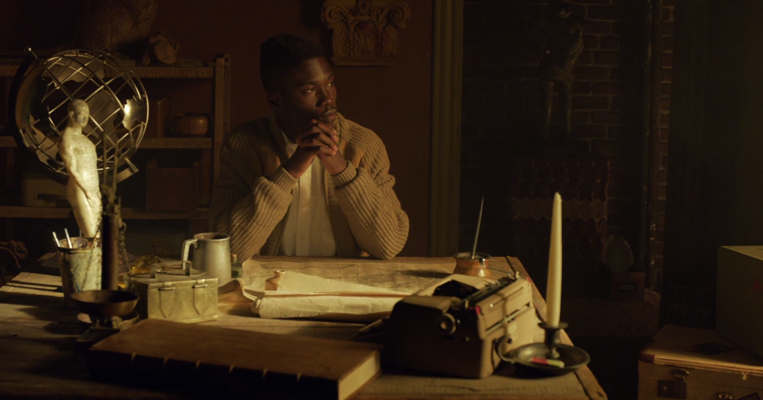
The gentleman looks great, which is one of the benefits of shooting actors with black skin: you can light them with just about any color of light and they’ll look amazing. Light skin fights that kind of color treatment so this look would not have worked on a caucasian. But… the rest of this scene reminds me of the parking lot up the street from my home after sunset. The shape of the light is nice, but the color really doesn’t work for me. (For the record, my color picker shows that portions of the window have actually tipped over from the red side of yellow to the green side.)

This image looks like as if it was graded yellow on purpose, and it works fine here. This is an established look that we’ve all seen on TV. It’s a little low contrast for my taste but it’s still very pretty. I’m not completely sure what this part of the demo is meant to show, though. I look at every shot in a new camera’s demo reel and ask, “What does this show me that another camera can’t do?” In the case of this shot the answer is, “Not much.” Still, nice look–and it does show off Panasonic’s signature rich and smooth flesh tones.
Once again, there’s that familiar yellow hue. It looks great on landscapes as long as the yellow hues don’t approach clip. The sky is what caught my attention in this image: it has a fair amount of red in it, which causes the dark sky in the top center of the frame to shift a little towards purple, but it also has a lot of green in it. The corners of the frame almost look cyan, which is typical of Sony’s older SGamut color space. It’s not unusual for camera manufacturers to mix a little green into their blues as it makes skies pop a bit more, but I consider that to be a bit like visual “candy”: it tastes good but it’s ultimately not very filling. It’s nice to have options, but I prefer blue skies over greenish blue skies.
(Note the blurry dot at the top right of the frame. That’s most likely a piece of dirt on the lens or on a filter, and as it’s so noticeable I’m going to guess the lens used was a zoom. Spots on the front of a zoom lens are farther from the entrance pupil, which makes them appear sharper, as opposed to primes where they are very close to the entrance pupil and appear a lot softer.)
Here’s a more dramatic example that shows how much green is mixed into the blue channel. According to my color picker the water at far left is actually cyan, or equal parts green and blue. The sky reminds me of Sony SGamut’s candy-coated cyan skies. This is fine as it’s artistic license and part of what gives a camera a look, but I prefer natural understated skies. (I’ve often wondered why, and I think it’s because video cameras have reproduced skies as candy-coated cyan for so long that the real thing registers as a pleasant surprise.)
Notice, once again, how much yellow is in the image. The clouds along the horizon are straw colored and the patches of sunlight raking across the shady hill at left are a yellowish orange. It is really interesting to see how well and often Panasonic renders yellow hues. I’m not used to seeing that hue so often in video, but I’m starting to wonder if I’m going to see it a bit too much in this camera. This is definitely a look I’ve seen out of Panasonic cameras in the past, or at least that’s what my fading memory tells me, so I don’t think it’s simply an artifact of the grade–but I don’t know that it appeals to me as much as it did ten years ago when I last touched a Varicam.

I found this sequence hard to look at. The colors are just too saturated for my tastes. This kind of thing works great for sports and talk shows, but not so well for feature films or spots. Hopefully we can dial this look back a fit for dramatic material.
What’s interesting about this is how saturated red is. When I look at it with my color picker it’s about 150 units more saturated in the red channel than red or blue. That’s a huge amount of color channel separation, and it’s rare in a color like red whose spectrum has to be carefully trimmed in-camera to avoid IR contamination. Alexa does red very well, but this red is outstanding.
My jaw dropped when I saw the red in those windows. It’s got a touch of blue in it and appears almost burgundy in color. Wow, I’m really not used to seeing that hue come out of a video camera. Red could be Panasonic’s signature color, if it’s not overdone.
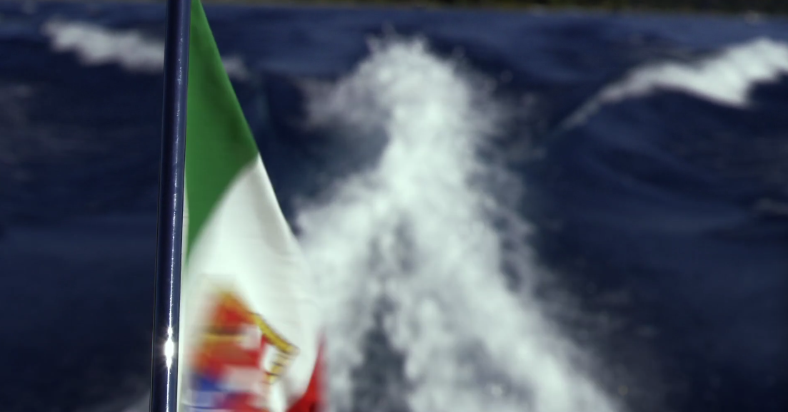
Here’s another example: the red in this flag is really rich and really red, and ONLY red. Alexa reds tend to be a little on the cool side, Sony reds tend to lean toward warmth, and Canon reds tend to be very orange, but Panasonic appears to nail pure red perfectly. That’s what I remember from my Varicam and SDX900 days: Panasonic cameras were able to reproduce colors accurately that other cameras couldn’t touch.
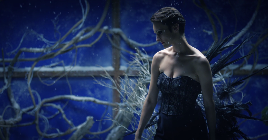
It’s hard to tell what the dynamic range of the camera is, or how much of what we see here is the result of a grade. There are certain aspects that seem consistent: punchy yellows and deeply accurate reds are quite common, but it’s also clear that flesh tones–which are normally rich and yellow–can also be reined in when necessary. This image appears to show that: bright flesh tones are very neutral, which I find quite pleasing, and the image has a lush coolness to it that we haven’t seen out of this camera so far.
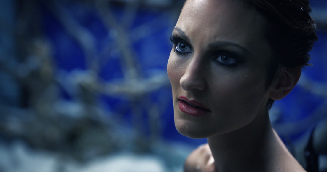
This is a good sign. I don’t like crazy saturated colors overall, so seeing some cool, less saturated flesh tones makes me feel all warm inside. Excluding the blue background, this would be a great look for a feature. Including the blue background, this is an amazing look for a spot.
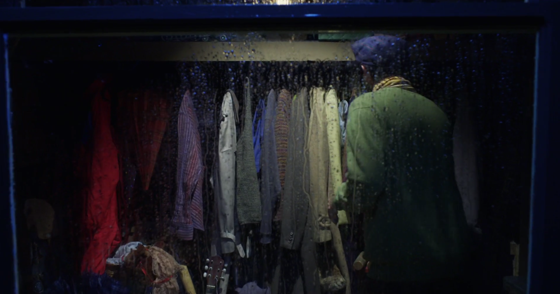
This image, in particular, gives me hope. This shot has that “painterly” quality that I’ve always associated with Panasonic cameras, and until now I’ve had a hard time putting a finger on what that is. The answer, it seems, is that they simply do secondary colors better than anyone else. We’ve seen a lot of blues and browns and yellows and reds so far in this demo but we haven’t seen anything that’s got a lot of subtlety to it. This shot reveals that subtlety. Look at the different hues in the brown and tan jackets to the right of center frame. Look at the purple coat toward frame left, or the hint of rich blue fabric in the center of the frame. That red coat at left is REALLY red, but the sweater the man is wearing is a very interesting subdued yellowish green that I don’t think would photograph nearly as beautifully on another camera. This camera reproduces color in a way that reminds of me of a Hopper painting.

That’s a really interesting pale blue. I’d love to see how another camera would render it. I’m so struck by how pretty it is that I’m not sure I’ve ever seen anything like it come out of a video camera before.

The bright blue in the background worries me. Saturated highlights are eye candy: they work for certain things, like car commercials, but if I saw them in a feature or TV show I’d probably flinch. Alexa would render that blue as a much paler hue, and I would prefer that look for most things. In fact, none of the colors in this frame would be this saturated if captured by an Alexa, as Alexa emulates film and the most saturated colors in film are always in the mid-tones and shadows.
I’d love to have this look as an option, but I’d also like the option of limiting saturation the way Alexa does. I’ve suggested to several manufacturers that they incorporate a knee point and slope for color saturation, where I can say “Allow saturation to increase up to this exposure level but from there on allow colors to only get brighter, not more saturated.” That’s what Alexa does: a color will never be more saturated than it is at 40% (middle gray) on a luma waveform. Beyond that it will get brighter but not more saturated.
It may be too difficult to implement this kind of control in a really broad color space so I’d settle for LUTs that limited saturation beyond, say, 30%, 40%, 50%, 60% and 70% on a luma waveform. That way I could choose how saturated I wanted my bright mid-tones and highlights to be and more carefully customize the look for each project. (Yes, I know this can be done in the grade, but I shoot mostly spots and high-end corporate projects and my clients want to see the look as we’re shooting it.)

There’s nothing here we haven’t seen already. It’s beautiful: the back wall is a luscious cyan, and the cool red in the girl’s dress is a subtle hue I’m not used to seeing many cameras reproduce well. Alexa could probably do this, and Sony’s SGamut3.cine might as well, but the red in this image pops in a way that I don’t remember seeing elsewhere.

Once again, Panasonic excels at reds… although the red here is a little too garish for me. As I wrote this I figured out what bothers me about it: it’s orange red, or fire engine red, the way Sony used to reproduce ALL reds (and the way Canon does now). That may be the color that was actually present on location but I have such a visceral reaction to it based on history that I just don’t like it. I blame Trinitron TVs for this, not Varicams. (Trinitron red phosphors were a bit dim compared to green and blue so they added some green phosphor to the red phosphor to make it brighter. This orange-red look took over television for over a decade.)
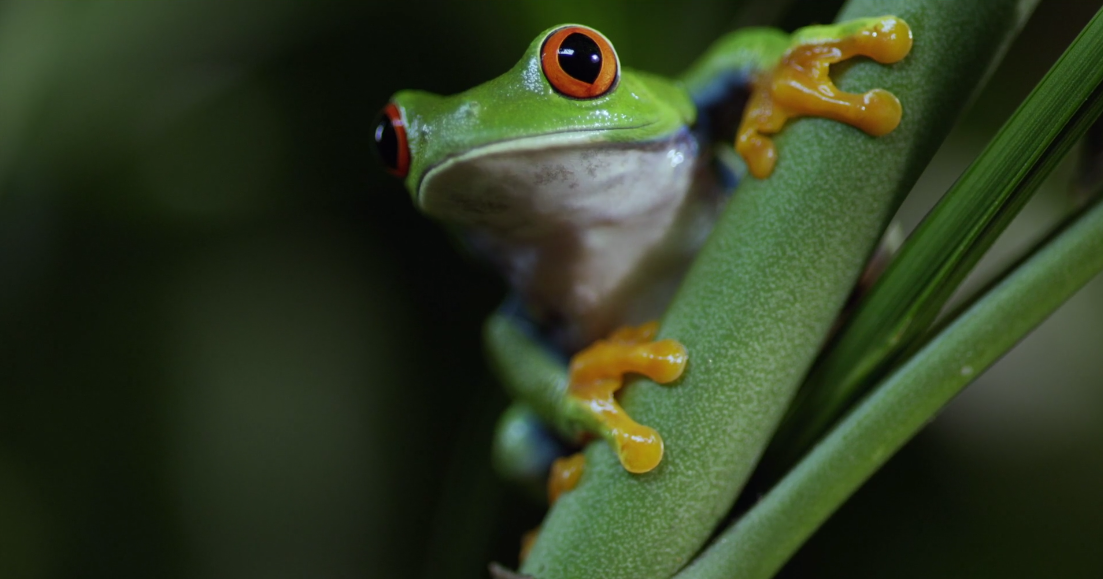
This is beautiful color, but way over the top for most of what I shoot. This feels like IMAX Junior, where the lizard looks like it’s going climb out of my screen. The subtlety of hues is amazing, even if the image is more saturated than I normally like.
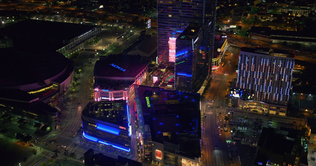
It’s clear Panasonic excels any time one wants to reproduce environments with accurate, saturated colors. I don’t think many cameras could capture this night shot with anything near this kind of dazzling accuracy.
It’s funny: I have no reference by which to judge the color accuracy of this image but the fact that the blue neon has just a whisper of red in it and the warm neon is a pinky salmon instead of simply red or pink convinces me that it really is accurate. There’s something about subtlety and delicacy of hue reproduction that says to me, “This is real!”
Once again, though, I think this kind of saturated highlight reproduction works well for eye candy but not necessarily for dramatic narratives. I’d love to see more evidence that this camera looks good when highlight saturation is reined in a bit.
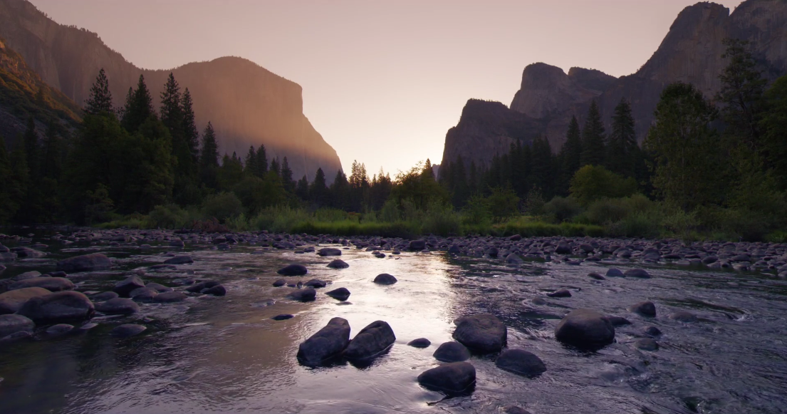
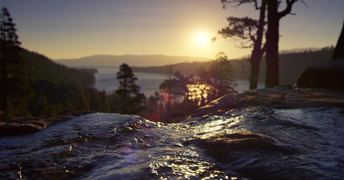
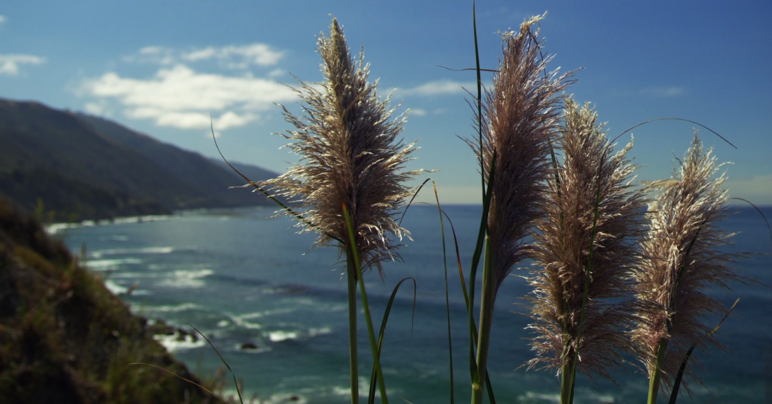
I’ll end with the same shot Panasonic did, because it’s stunning. The sunlight is a slightly reddish yellow that feels very real to me. (I reproduce this look on set by mixing CTO and 1/8 or 1/4 minus green gel on tungsten lights. Minus green gel, of course, subtracts green from light.) The reflection of the sky in the water is slightly purple, which feels right given the coolness of the sky combined with the warmth of the sunset. Those of us born in the U.S. will recognize “purple mountain majesties” at frame right.
This is a gorgeous image that reminds me of either a painting or a transparency.
This is a reasonably good demo for the new Varicam 35. The one thing I can’t really assess in this demo is dynamic range. There are some high contrast shots but nothing that says, “I couldn’t do that with an Alexa or an F55!” Here’s hoping they do another test that addresses this oversight.
I see a lot to like in this demo reel. There are some things that worry me, such as greenish yellows and super-saturated video highlights, but I also see where these can be useful depending on the project. I’m really excited by what I see in reds and the subtle hues that fall between red, green and blue. This camera has a definite look to it, and if I can tweak it just a bit I may be in heaven.
I may have to start thinking of Alexa as color negative film and Varicam as color transparency film. Both have their uses.
Camera companies really do have their own looks, and Panasonic has always put forth a strong one. Here’s hoping this camera is as good as we hope it is. Competition only makes things better in the long run.