
I’ve spent a long time learning to make HD footage look “filmic” without really knowing exactly what that meant. I’ve just picked up a bit of insight, however, and it’s permanently changed how I look at video and color.
I’ve shot a number of projects using an Arri Alexa in WYSIWYG mode — for which I’m considered a bit of an oddity — but with it I can get great results with no more than minimal grading and clients love walking away with ProRes files whose look is 90% there. My problem is that I now have to do this with other cameras as Alexa’s price point is considered “high” in my market due to the release of several newer, cheaper and fairly capable cameras. I love the Alexa look, but my current task is to figure out how to get close to that look when the production doesn’t have the budget to rent one — or, more likely, in the event the production company owns their own camera.
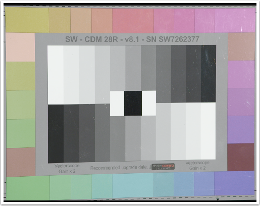
I shot a test recently to try to quantify what Alexa’s look is: I put a Sony F55 and an Alexa side by side in front of a Chroma Du Monde chart and rolled the aperture around to see what happened to color in the image as the exposure changed. The results surprised me considerably.
Before Arri made HD cameras they made film scanners, and it’s clear they learned quite a lot about how to reproduce the film look in the digital domain. One of the things they’ve learned is how film saturates colors in relation to exposure. The following clip shows how the F55 saturates colors, how Alexa saturates colors, and what happens when I try to match a portion of Alexa’s look to an F55 using DaVinci Resolve.
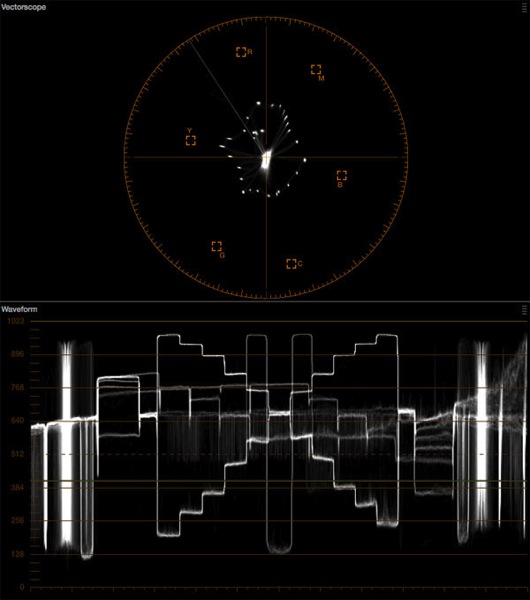
As exposure increases the F55’s color saturation increases as well, until luma hits around 65% on the waveform monitor. At that point saturation stops, and not much past that the colors start to collapse on themselves as the channels clip. This is classic HD camera behavior: most cameras do this.
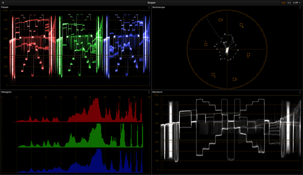
F55’s color saturation with middle gray on the chart at about 35% luma.

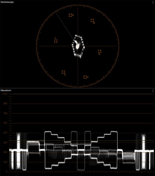
F55’s color saturation with middle gray at about 65% luma.
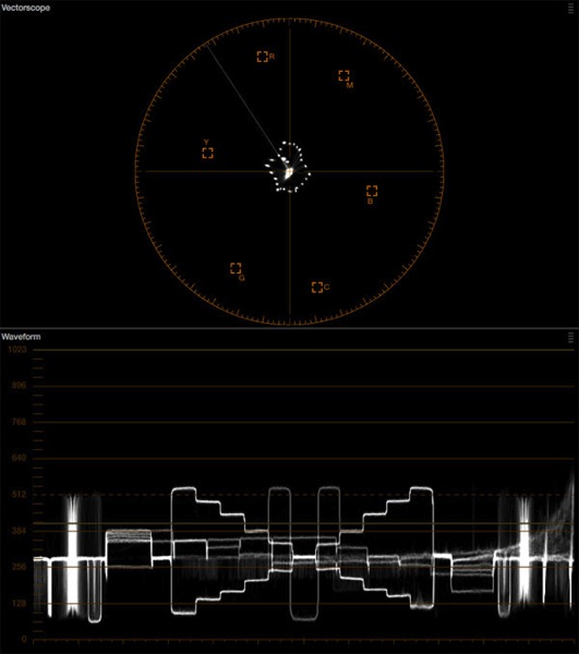
Alexa is different. In Rec 709 mode Alexa saturates color until luma hits about 30-35% and then saturation freezes. The image will increase in brightness but color doesn’t become more saturated at all. Brightness and saturation are completely independent as luma passes middle gray (around 40% on a waveform monitor).
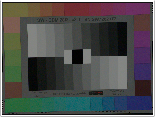
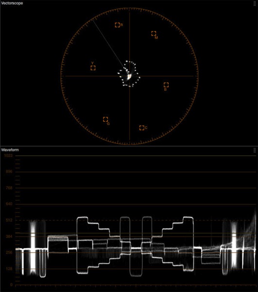
Alexa color saturation with middle gray on the chart at about 35% luma.
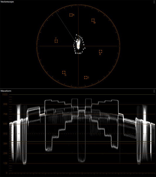
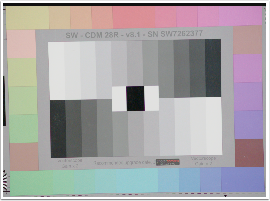
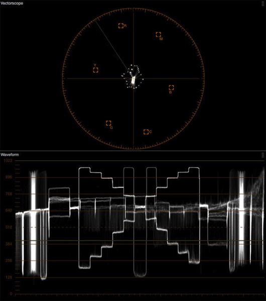
Alexa color saturation with middle gray at about 65% luma.
Back in the days when I shot film, I was taught that the sweet spot for blue screen exposure 18% reflectance. I never understood why that was the goal, but recently I put this memory together with another where I learned that film can capture a saturated blue or a bright blue but can’t reproduce both at the same time. A bright blue will never be very saturated, and a saturated blue cannot be very bright.
Exposing a blue screen for 18% reflectance maximized both brightness and saturation: that was the point where you’d get the best of both.
This is what I seem to see with Alexa’s Rec 709 mode in comparison to the F55 in hypergamma mode. Sony’s F55 saturates colors until they clip and fail, whereas Alexa saturates colors to the point that film would, and no more.
Naturally I wanted to see if there was a way for me to replicate this look in an F55, and there just doesn’t seem to be any way to make that happen in the camera. I can control overall saturation in the matrix level control (which I always set to -10 or -20 anyway as I find Sony’s out-of-the-box color to be way too saturated for my filmic tastes) but I can’t limit what happens to saturation as the image gets brighter. What I really want is a control that allows me to limit saturation based on brightness: if I set it at, say, 35%, then color will saturate normally until luma hits that brightness level, at which point color saturation will be capped.
It’s quite a common trick for colorists to desaturate video highlights to make them look more filmic so I turned to DaVinci Resolve for a solution. There’s one adjustment that’s meant to do exactly this: the Lum vs. Sat curve.

Luma runs left to right (left is black and right is white), while saturation runs top to bottom (normal saturation is in the middle; pulling the curve up increases saturation and pushing it down decreases saturation). To desaturate color in a brightness range simply plot the points where the desaturation should kick in and them pull those points down to desaturate them. Easy, right?
Well, no. In order to make the F55 saturate color the same way an Alexa would I had to find the exact spot where color was fully saturated, and then plot a curve that perfectly countered the increase in color saturation as exposure increased. For example, I knew that Alexa was fully saturated by 35% on a waveform so I knew to plot that on the Sat. vs. Lum curve as a starting point, but then I had to find a way to keep the F55 pattern on the vectorscope display from expanding between 35% and about 70% where the color saturation maxed out.
Resolve doesn’t make this easy. Their waveform doesn’t read out in percentages, only in code values, so I had to guestimate where middle gray fell. In addition, the Sat. vs. Lum. curve plots points in “normalized” values where the available numerical range is 0-1 instead of 0-100 or 0-109, so I tried plotting the start of my desaturation curve at .35, assuming this was somewhat equivalent to 35% on a waveform. This turned out to be a little too generous as saturation was meant to be locked by 35% and starting my desat curve there meant color saturated a little more before the curve really kicked in, so I lowered the start point back to .20 instead.
Then I had to look ahead to where color started falling apart, and discovered that this happened on the F55 around .65 on the Sat. vs. Lum. curve, so I put a point there and pulled it down until the width of the vectorscope diamond was the same as it was when the exposure passed my other point, at .20. By plotting a curve between these points I strived to subtract exactly as much saturation as was being added as exposure increased, in essence splitting brightness from color saturation.
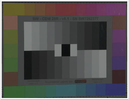
This is the F55’s saturation at about 65%.
This is the F55’s saturation at about 30% with my curve applied.
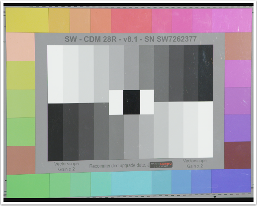
This is the F55’s saturation at about 65% with my curve applied. The shape of the vectorscope pattern nearly matches saturation at around 30%, which means that I’ve managed to somewhat decouple saturation from brightness the same way Alexa does.
I think this trick was partially successful. The F55 clearly doesn’t have the same look as an Alexa due to some fairly obvious color rendering differences. There’s something about Alexa’s color that is very pure and distinct, and even though it gets brighter without becoming more desaturated the color doesn’t feel like it becomes “thinner.” Sony’s color feels a little artificially desaturated when I look at it on the chart, but it may look very different in real life.
Certain colors continue to pop in the F55 as exposure increases. Yellow, for example, stays really, really saturated, way beyond what Alexa allows. As yellow’s component colors—red and green—are key components of flesh tone maybe Sony is trying to retain pleasing flesh tone as long as they can, but I really don’t like that overly bright yellows become very saturated without a bit of cleanup.

This is what Alexa’s highlight saturation looks like.
This is what the F55’s highlight saturation looks like with my curve applied in Resolve.
It’s not a bad match at all: in some ways it’s pretty close. Yellow is clearly more saturated on the F55 than the Alexa, as is the flesh tone patch directly underneath it, but the other colors appear similar. There’s a softer, prettier quality to Alexa’s colors that’s hard to quantify, but the F55 looks much, much better, at least to my eye.
If you’d like to reproduce my custom curve, here’s where all the points fall:
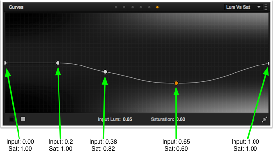
The first and last points will be in place by default. To quickly and accurately place the other points just click anywhere on the Sat. vs. Lum. line to create a point and then enter the values into the Luma and Saturation boxes below the curve to move the point to the proper position.
What I was finessing the curve I noticed that F55 colors desaturated well to about 65% and then bumped down in saturation and held through about 75%, and then desaturated nicely on their own. I compensated by making my desat curve max out at about 60% and then slowly bringing saturation back in as the camera desaturated colors naturally. As saturation increased beyond my preferred level I forced the curve to desaturate to compensate, and as saturation decreased naturally I caused my curve to bring saturation back to normal.
Give this a try and let me know if it does something nice to your footage. Meanwhile I’m looking forward to another F5 / F55 or Canon C300 / C500 shoot (Canon cameras saturate color in roughly the same way, so this trick should work there too) to see if I like this look more than I do desaturating the Sony image overall, the way I usually do. I don’t know that this curve will work this precisely with any other camera but it’s worth taking a look.
Disclosure: I’ve worked as a paid consultant to DSC Labs, who make the Chroma Du Monde chart used in this article.
About the Author

Director of photography Art Adams knew he wanted to look through cameras for a living at the age of 12. After spending his teenage years shooting short films on 8mm film he ventured to Los Angeles where he earned a degree in film production and then worked on feature films, TV series, commercials and music videos as a camera assistant, operator, and DP.
Art now lives in his native San Francisco Bay Area where he shoots commercials, visual effects, virals, web banners, mobile, interactive and special venue projects. He is a regular consultant to, and trainer for, DSC Labs, and has periodically consulted for Sony, Arri, Element Labs, PRG, Aastro and Cineo Lighting. His writing has appeared in HD Video Pro, American Cinematographer, Australian Cinematographer, Camera Operator Magazine and ProVideo Coalition. He is a current member of SMPTE and the International Cinematographers Guild, and a past active member of the SOC.
Art Adams
Director of Photography
www.artadamsdp.com
Twitter: @artadams