
Two shirts, two different colors, exactly the same fabric… why does one moire and one not?
The answer goes to the root of how single sensor cameras work…
 The CEO wanted to wear his company’s shirt during the interview. I live in Silicon Valley, and a fair amount of my work is high-end corporate which translates roughly into “I shoot a lot of really pretty talking heads.” Often the client doesn’t take our clothing requests seriously so it’s always interesting to see what they’re wearing when they show up. In this case the CEO was adamant about wearing a shirt with his company’s logo on it, but he brought three colors: green, orange and dark blue. They were all the exact same stretchy sports fabric peppered with tiny holes and crisscrossed with a faint weave, but at least we had options.
I immediately voted for dark blue. It contrasts nicely with skin tone: warm skin looks great against cool backgrounds, which is probably why the orange/cyan feature film look is so popular. (Also, you’ll frequently hear “warm colors advance and cool colors recede” in design circles, and it’s true: warm colors feel better, and closer, in front of cool colors, which feel a bit farther away. Think of hazy blue mountains on the horizon.) Flesh tone and blue are complimentary colors: put warm flesh tone in front of a cool background and the person “pops” right off the screen.
Orange tends not to be as good a color for skin tone as the two compete. If the orange is really bright and saturated then faces start to look sick and slightly cold as our brain compensates for the strongly-colored background. This doesn’t happen as often with shirts but I’ve certainly seen it happens on projects where the company wants its interviews shot against a background that matches their brand color, and that color is red or orange.
Green isn’t a bad color. If it’s a really bright saturated green then the eye might try to compensate by removing some of it, which would make flesh tone appear a little redder and ruddier as it shifts toward magenta. I’ve seen this in green backgrounds but not green clothes, so while this wasn’t my favorite shirt color I didn’t complain too loudly… until the CEO sat into frame.
Wow, did that shirt moire. All those little holes, and the subtle pattern one sees in sportswear that’s designed to “breath” — they exploded. There was a brief discussion about suiting him up in a dress shirt, but he really wanted to be seen in his company’s logowear so we opted to try another color — in this case, blue (I won that round). The CEO stepped away, changed, came back, sat down…
No moire. Exact same fabric, same pattern, no crazy aliasing. It took me a minute to figure out why. The biggest clue lies in the design of a Bayer pattern sensor:
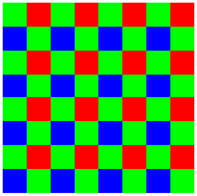
Most of our perception of brightness comes from the color green, and indeed the luma signal (Y’) in Y’CbCr video is comprised of 71% green, 21% red and 7% blue (roughly). Because green is so important it is sampled twice as often as red and blue, as you can see in the image above.
Bayer patterns are a compromise. The camera’s processor, or post processing software, must go through every photosite and guess the missing colors based on the photosites around it. This has a huge impact on resolution: the rule of thumb is that any given Bayer pattern sensor will, at best, yield only 80% of its possible resolution (and that’s with really amazing lenses). For example, a 5K camera will never give you more than 4K resolution; a 4K camera will never give you more than 3.2K resolution; etc. That’s one of the reasons that the Alexa is a 2.8K camera and not a 2K camera: in order to capture true HD that extra .8K is a solid requirement.
Ultimately, though, most things that appear in front of the camera are captured at fairly high resolution because very few of them are pure red, green or blue: there’s almost always information in surrounding photosites to flesh out what’s happening at any individual photosite. Pure hues, though, can be problematic. For example, a pure blue screen will photograph at only half the resolution of a pure green screen, because it’s only triggering ¼ of the photosites on the sensor instead of ½, so blue screen edges may appear softer than green screen edges.
And, while Canon cameras use a Bayer pattern, they don’t always process it in a traditional way. The C100, C300 and C500use exactly the same 4K Bayer pattern sensor, but the C100 and C300 don’t use a deBayering process. Instead of the camera’s processor analysing each photosite and its neighbors to find missing colors, it instead collects 2×2 clusters of photosites and makes them into one pixel. If you start with a 4K image and simply bin 2×2 blocks of photosites into pixels you end up with enough pixels to make an HD image instead. It’s a fairly clever process and saves more than a little processing power.
Regardless, the same issue exists: green is sampled at twice the resolution of red or blue, so a fine green pattern that shows moire may not do the same in either red or blue. In the example given above the difference between colored shirts was amazing: where the green shirt was nothing but shimmering lines, the blue shirt was soft and almost devoid of texture.
Simply changing out a color isn’t a solution for every moire situation, but once in a while it’s the perfect solution to a vexing problem. And, luckily for us, cinematography requires knowing thousands of these kinds of solutions for that one time, every ten years, when you can pull something like this out of your pocket and save the day.