
Television shows with strong compositions were my earliest influences, and I’m happy to say that there’s one show on “TV” right now whose compositions move me the way my early influences did: Netflix’s House of Cards.
There’s a shot in episode 10 that dazzled me with its simplicity. Claire has just confronted Zoe in her apartment, after which she steps onto the street and walks a couple of steps before stopping and turning. When she stepped into the street she dropped in frame such that she had at least a third, and maybe a little more, of the frame as headroom, but as she stops and the camera pushes in she grows in frame until the composition is absolutely perfect. That little moment of tension, when she was pushed toward the bottom of frame, was totally relieved as the camera pushed in and, without tilting or panning, landed on a perfect composition.
I call that “power” composition. The camera is almost too cool for the subject matter. I love it.
One of the lessons that I learned long ago, primarily through watching British television and movies from the 70s and 80s, is that compositions happen in both time and space. The first time I really noticed this was while watching a movie called “The Hit,” starring Terence Stamp and John Hurt. I haven’t seen the film in quite a long time but I remember a shot where the camera was placed very low, looking up at the side of a car and a lighthouse in the background. One character is standing on the right side of frame, completely unbalancing it, having a conversation with another character offscreen. The conversation goes on for quite a long time, and the combination of not seeing the other person and watching this very unbalanced composition was a bit unnerving. At the end of the scene the other character steps into frame left and leans against the car, perfectly balancing the character on the right. I was stunned.
I couldn’t find that scene on Youtube, but here’s another one with some amazing compositional work. (Note: This is most definitely not a “feel good” movie.)
Maybe this is a small thing to others, but to me this kind of composition was a revelation: creating an unbalanced composition for most of a scene and then balancing it toward the end caused a dramatic build and release of tension that added rhythm and power to the performances.
House of Cards does this, and other things, to impart an intense feeling of power to every frame. It’s very sophisticated eye candy of the kind that I don’t see anywhere else… which is deeply unfortunate.
I pulled a number of frames from the House of Cards trailer on Youtube to illustrate a number of points. You could do a lot worse than watch it after reading this article, just to see if I’m right… or better yet, to see if I’m missed something.
Before I go into more detail about what I’m noticing in this series, I want to talk about the importance of theme, or a through line, in cinematography. Every script has at least one underlying layer of meaning, as does every character, that guides their development and their actions. Once you figure out what that is it can significantly help you in making creative decisions. For example, in this interview with director of photography Eigil Bryld, he mentions that one of the underlying themes is “power,” so every shot is designed with that in mind. Of course you have to define how power is represented visually, but now you have a direction in which to explore.
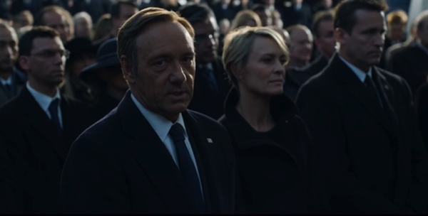
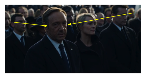
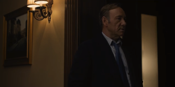
Who has power in this shot? Could it be the person in the center (one of the strongest compositional points in an image) who is higher in the frame than anyone else and is framed between the two brightest objects in the image, to which our eyes are naturally drawn? Frank Underwood towers over everything in this shot, and the highlights won’t let us look away.
If you know what the underlying themes are they will most likely guide you in how to design shots that will advance that theme. This kind of planning adds consistency and continuity to any project. The performances tell a story, as do the music, editing and lighting… so why shouldn’t the frame do so as well?
House of Cards employs a lot of static shots. When they move the camera they use what I call the “David Lean method” of camera movement, which you can see when watching any of Lean’s great epics (Lawrence of Arabia, Doctor Zhivago, etc.). Every shot is a window into another world, and it doesn’t chase characters around: it sits and gives you time to look around. This window is also carefully placed to capture the essence of the scene, and once set the scene plays out within it. There is no shaky-cam, or lots of overcompensating”floaty” camera moves that demonstrate that the operator has amazing reactions that can respond to the flicker of an eyelid. Rather the camera sits on a frame and lets it play out, and when the camera moves it doesn’t so much follow a character as it simply shifts to another point of view in the same amount of time that it takes the character to move to their next position. The camera doesn’t follow, it simply moves from composition to composition–almost as if it doesn’t really care.
House of Cards cuts between different angles a lot more than a David Lean film will, but when the camera moves it’s not floating and following something: rather, it’s moving from one frame to another and it just happens to be traveling at the same speed that someone in the frame is moving. When it lands, it lands in exactly the right spot. There is no last minute compensating for a missed end point. Once the camera lands, it stops. That’s power.
The show favors pans over tilts, and for some reason I can’t quite figure out that adds significantly to the feel. Once and a while they’ll tilt down to reveal something, but otherwise vertical moves are done on the dolly arm without any additional tilt from the camera. As a person sits, the camera descends and lands perfectly on a new frame, no tilting required. There are lots of examples of this in the trailer below.
Some of the panning shots are amazing. There’s a sequence in episode 10 where Zoe wanders around Frank’s master bedroom, snooping into Claire’s possessions and trying on one of her dresses. The camera starts looking into the bedroom as Frank sits by the bed, in the foreground, as Zoe looks around in the background. At some point she walks frame left and the camera follows, leaving the bedroom door and moving down the wall until it lands, perfectly centered, in the bathroom doorway just as Zoe enters. The camera slowly pushes in as Zoe snoops further, and then just as the frame is getting close to cropping out Zoe’s head she moves through another door. The camera follows and lands perfectly on a shot of Zoe, on the right side of frame, opening the closet door and pulling out dresses, while on the left side of frame we see Frank step into the reflection of a full-length dressing mirror in the background.
The camera never tilts. It pans, and the dolly moves, and that’s it. It’s an incredibly powerful, slow-moving and perfectly executed dolly shot. It’s stunning.
Here’s an example of a horizontal move in the trailer. The camera starts here:
…and pans left to land here:
The move is perfectly executed and is perfectly horizontal. I can sense the power. Can you?
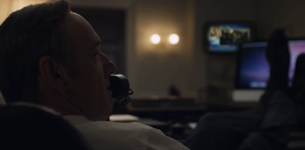
There’s another great example of composition in this scene. Here’s Frank’s MCU:

There are three reasons we want to look at him in this frame:
- He’s looking at us.
- He’s in focus, while everyone else is soft.
- There are invisible lines that tell us to look at his face.
Have any doubts about (3)? Look at this:
It’s classic triangular composition, brilliantly executed. This shot isn’t just coverage, it tells a story all its own beyond the performance and the dialog.
This show plays around with headroom, which I love. In film school students are often taught that headroom is “this much” below the top of the frame, or just inside the action safe markings. This works for a lot of situations but, like most rules learned in film school, as you become more skilled in your craft it ends up hindering more than helping. Still photographers don’t worry about headroom; they craft full-frame images that work compositionally for whatever space they are trying to fill. There are many shots in House of Cards that show “too much” headroom, but at the same time are bounded by some element, usually a piece of architecture. For example, if a person is sitting low such that their head is only 2/3’s of the way up the frame, the top of the frame will be defined by the top of a door in the background. The camera isn’t framing specifically for the person; they’re framing for the person within that environment, and for a mood that calls for the character to be lower in the frame, as if all that extra space is pressing down on them.
Each shot tells a story about the power relationship between the people in the scene, or the relationship between a character and the world. I couldn’t find a good example in the House of Cards trailer, so here’s one from a clip of “The Hit” that I found on Youtube:
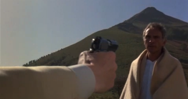
Terence Stamp is low in frame and pushed toward the edge, minimizing him in every way. The composition emphasizes the mountain, which de-emphasizes him. House of Cards does this a lot, putting someone low in frame but completing the composition with an architectural element just below the top of the frame.
Fluctuating head room is a hard lesson to teach film students. It’s perfectly obvious if you’re ever seen a several-hundred-year-old landscape painting in a gallery, as all the action is at the bottom of the painting–around eye level–and the top of the frame is filled dramatic sky or trees that frame and enclose the action below. These paintings are meant to be viewed as you would view an actual landscape: all the action happens at eye level and the sky is present if you happen to look up. The sky is often painted in such a way that it accents and frames the action below, so while it isn’t the point of the painting it certainly helps tell the story.
Years ago I shot a project on the coast in very funky weather, and at one point I set up a wide shot looking across the beach at an elderly man walking across a series of stepping stones. I framed him on the very bottom of the frame, with contrasting white and dark clouds high above him, and the shot was completely stunning. The weather was so dramatic that it really emphasized this small figure battling the odds to hop from stone to stone.
There was another camera operator on the set, and they sat next to the director in video village. As I set the shot and prepared to roll I saw the other camera operator lean over and whisper to the director, and then the director yelled over to me, “Less headroom!”
“But, but…”
“Less headroom!”
So I tilted down and ended up with the stepping stones running right through the center of the frame, missing the most dramatic part of the sky and filling the bottom of the frame with wet, brown sand. This other camera operator, who was just visiting, managed to sabotage a beautiful, painterly shot because they’d never moved beyond the idea that headroom is always “this much,” and they were physically closer to the director than I was.
Sometimes House of Cards employs single point perspective, much the way Kubrick would, to perfectly frame a person within an environment, but whereas Kubrick did this habitually they do this selectively. They’ll also frame a character so that their head is perfectly in placed in the center of a background object, like an out-of-focus painting. To me this sends a very subtle message that this person is being firmly put in their place.
They’ll shoot two shots that aren’t over-the-shoulders, but instead come around just far enough to see two of the characters’ eyes, perhaps to reflect the disconnect between the two characters. Sometimes they’ll move from over-the-shoulder to this two-eyed closeup and to completely profile. There’s clearly a lot of thought that goes into camera placement based on the mood of the scene and giving the editor the option of changing the perspective of the scene as the characters interact.
What I like the most is that they almost never do a conventional tilt and pan together. Perfectly horizontal and perfectly vertical moves tend to be quite powerful–almost aloof–and there are a lot of those in House of Cards, particularly during tense scenes.
There are exceptions to these “rules,” though. In episode 13, which I watched last night, they did a dolly-in-boom-up move that sees the camera doing a diagonal dolly move up and into into someone’s face. It appeared as if the dolly grip executed the entire move and the camera just sat there. It was stunning.
And, of course, the camera almost never looks down on someone. It’s nearly always looking up, a little or a lot. There are exceptions to this as well, but when they occur you really, really notice because they happen for a reason.
Here are some other examples:
What does this say about the power relationship between these characters? Also, what does it tell us about how they relate to each other in space? This is a two dimensional image, but it sure doesn’t feel like it. Isn’t it just an awesome shot?
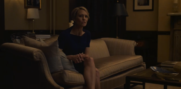
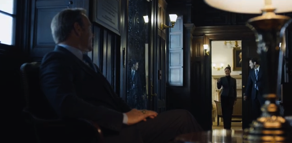
What can we tell about the relationship between these characters just based on these two shots that cut directly against each other? Who is master and who is servant? Notice how Claire is framed both by the door in the background, the two lamps and the shape of the couch, while Frank is framed in the doorway, between the picture and lamp on the left and the window on the right. Look at their size relationships. Claire is leaning in, but Frank doesn’t even make eye contact.
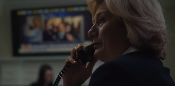
What about these two characters? Who is dominant here? Frank Underwood fills the entire frame side to side, while his newly installed Secretary of State fills the gap between his head and his feet. Compositions happen both within a shot and across edits; they can happen in both space AND time. A compositional element in one shot can balance elements in an adjacent shot, which firmly ties them together.
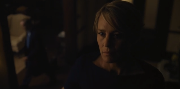
I think it’s fairly obvious how Claire feels about Frank in this scene. You don’t have to hear a word, this image says it all.
Here’s the House of Cards trailer on Netflix. Watch how the camera moves are generally horizontal or vertical but not both. Also note how they aren’t really “following” characters as much as they are simply moving with them from one place to another.
Shows like this give me hope. I don’t see strong compositions in features and TV very often as the emphasis seems to be on simply getting enough coverage to cover the edit rather than casting the camera as an additional character. My first love was composition, and I very rarely see productions that take it seriously. Sophisticated compositions require some thought and planning, and it seems that many directors just aren’t that interested in working with their DP to create compelling images. Instead we see a lot of shaky-cam, or shooting wide and tight shots from the same angle, which is all fine if that’s all the story needs. But if you’re telling a powerful story it makes sense to use more powerful tools, and composition is one of the most powerful tools we have at our disposal. It’s also one of the simplest: just put the camera in the right place at the right time. If you understand the story and the underlying themes then no matter what you’re shooting–feature, TV series, spot, web banner–the script will often tell you where the camera should land, or at least guide you to a range of choices from which to choose.
There’s no rule that says we need to employ strong compositions to create compelling images. But if the opportunity is there, and it works for the project… why not? In a world where strong compositions are rarely exploited there’s plenty of room for cinematographers and directors who get it to stand out. Images can tell us things about characters that they dare not say out loud, and that’s not only great storytelling but it’s fun and satisfying as well.
About the Author

Director of photography Art Adams knew he wanted to look through cameras for a living at the age of 12. After spending his teenage years shooting short films on 8mm film he ventured to Los Angeles where he earned a degree in film production and then worked on feature films, TV series, commercials and music videos as a camera assistant, operator, and DP.
Art now lives in his native San Francisco Bay Area where he shoots commercials, visual effects, virals, web banners, mobile, interactive and special venue projects. He is a regular consultant to, and trainer for, DSC Labs, and has periodically consulted for Sony, Arri, Element Labs, PRG, Aastro and Cineo Lighting. His writing has appeared in HD Video Pro, American Cinematographer, Australian Cinematographer, Camera Operator Magazine and ProVideo Coalition. He is a current member of SMPTE and the International Cinematographers Guild, and a past active member of the SOC.
Art Adams
Director of Photography
www.artadamsdp.com
Twitter: @artadams