
The first series of Sony OLED pro monitors looked green to me, and until recently I didn’t know why. It turned out I wasn’t hallucinating, and I now know a little more about what I didn’t know I didn’t know.
A recent travel job saw me traipsing through three U.S. cities in six days. We carried two cameras with us, but to save on shipping costs we rounded up monitors and tripods locally. My home market, the San Francisco Bay Area, has a long history of being technologically adept, to the point where it was part of our culture to have a video engineer on set at all times (at least until the RED ONE came out), so it’s not at all unusual to have a fairly wide selection of 17″ monitors at our local rental houses.
My current favorite field LCD is the TV Logic 17″, which seems fairly color neutral compared to the old standby, the Panasonic 1700 series, which tends to skew yellow-green. (TV Logic 17″ blacks are a little blue, but at least flesh tones reproduce with some degree of accuracy.) One or two rental houses have Flanders Scientific (FSI) monitors, whose color is relatively good but aren’t considered robust enough for field use. One rental house carries Ikegami LCDs, which are very good but tend to be front heavy and difficult to use on rolling stands.
The monitor everyone should be using, Sony’s OLED PVM-1741, doesn’t show up much. While the color accuracy is largely unsurpassed by anything short of a CRT, they have historically skewed green even when properly calibrated. Years ago I asked Sony about this and received startled looks in response, so I assumed there was something about the viewing environment on set that influenced how I saw the image. I’m somewhat familiar with how easy it is to fool the eye into seeing things it really doesn’t, so I assumed the issue was perceptual: after all, how could the most accurate existing monitor technology be wrong? Clearly there’s a short circuit in my brain causing this color shift… but until I understand how and why I need to use crappier monitors that I understand better.
It turns out there’s nothing wrong with the technology itself, or with my brain, but with the math behind OLEDs and color spaces.
During my road trip I was consistently offered two monitor choices by rental houses around the country: a Sony PVM-1741 OLED monitor or any of the Panasonic 1700 series LCD monitors. (In one case, when I asked specifically about TV Logic 17″ monitors, I was told “That’s a California thing.”) In each case I opted for the Panasonic monitor as I knew what I was getting: I’ve trained my brain to see past the yellow-green shift and recognize what the image really looks like. I was frustrated, though, by the fact that the only familiar series of monitors I could find on location were consistently the oldest and among the least color accurate. Upon my return I called a contact at Sony and complained: “I’d love to use your monitors but I’m not used to that green shift. I’m don’t think I’m dreaming, it’s actually there–and it drives me nuts!”
His response: “Oh, we fixed that last year. Turned out to be a very sneaky thing. Let me send you some white papers.” And he did.
An awful lot of color science revolves around a handful of color studies performed at various times by the CIE, or the International Center for Illumination (Commission Internationale de L’Eclairage). In particular, most monitors are modeled around CIE 1931, a theoretical color model developed around an experiment where 17 individuals were tested in an attempt to map the gamut of human color response. The resulting function curves attempt to show how the long, medium and short cones in the eye (that roughly correspond to red, green and blue sensations) respond to different wavelengths of light:
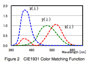
CIE 1931 color matching functions. The curves correspond roughly with the average person’s visual response to red (x), green (y) and blue (z).
Since then a number of studies have shown that CIE 1931 isn’t a perfect model at all. In 1951 a gentleman by the name of Judd suggested a correction to CIE 1931 for wavelengths below 460nm (corresponding roughly to blue). While not officially adopted by the CIE, the so-called Judd Offset became crucially important when Sony tried to match their broadcast-quality OLED monitors to a reference CRT monitor. According to their calibration instruments the two devices matched, but by eye they clearly didn’t: the OLED was much too green.
It turns out that CIE 1931 works well for monitors that use transmissive technology with a broadband light source. In simpler terms:
A transmissive display pushes light through tiny red, green and blue filters. This includes LEDs employing CCFL (cold cathode fluorescent lighting), where a flourescent light at the rear of the set is filtered by red, green and blue “light valves” embedded in the screen, and plasma displays, where cells of gas in the display act as tiny fluorescent lights that push light through colored filters.
In both these cases, the light emitted is fairly broad in spectrum, and while the spectrum isn’t perfect it’s broad enough to get the job done.
CIE 1931 fails in emissive displays, and displays that employ narrow band light sources:
OLEDs are emissive because their light is generated by individual pixels on the front of the display: they aren’t filtering another light source, each pixel is creating very pure, narrow spectrum hues from scratch.
CIE 1931 also fails in displays that use narrow spectrum transmissive light sources. Many LED LCD monitors work in the traditional way, by filtering light from a single type of LED into red, green and blue components, but some manufacturers use very narrow band red, green and blue LEDs to create richer hues. CIE 1931 works with the former, but the latter requires the Judd offset.
In both of these circumstances the narrow bandwidth of the emitted spectrum results in very pure color and a larger color gamut, but white balancing the monitor to CIE 1931 standards results in a monitor that looks green compared to a CRT reference. (This is due to a property called “metameric failure.” Calibration instruments will say that the white balance is correct, but by eye it’s clearly not… until the Judd offset is applied.
Here’s the original CIE 1931 function curve set with the Judd offset overlaid:
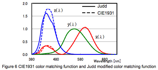
CIE 1931 color function curves with Judd modifications. Note that blue is most dramatically affected.
They roughly match, but there’s a fair bit of disagreement in the blue portion of the spectrum… and apparently that’s enough to skew the entire white balance of the monitor if that monitors employs narrow band (OLED or RGB LED backlit LCD) emissive technology instead of broadband (CCFL or single color LED) technology.
The trick to fixing this issue in OLED monitors is to white balance the monitor, using a probe, without the Judd offset applied, and then add the offset once calibration is finished. Or, in some monitors (such as Sony OLEDs) you can change the x,y values of the monitor’s white point manually. In this white paper (WhitePaper_ColorMatching_2013 02 15) you can read how to do this with Sony OLED monitors, and you can be fairly sure that the Judd offset is being applied–or should be applied–inside any LCD monitor that uses multiple-colored narrow spectrum LED backlights as light sources.
There is nothing simple about modern motion picture technology, and there’s no end to learning about motion picture technology. Key to this is having some understanding how the human eye and brain work: in a way, a camera and monitor are interfaces that communicate information to the brain, and it’s important to know all the ways that interface can fail and provide us with false information. (And it’s nice to know all the ways we can skew that information for emotional effect, when necessary.)