
Adam Wilt and I put on a show at CineGear about the Sony F55. Here’s part one of my side of the talk, possibly with more information than I gave at the time.
Adam focused on functionality, while I focused on what the camera looks like. These days cameras are computers with lenses attached, and it’s not unusual to turn on your camera after a software update and discover that you own a new camera. That’s what happened when Sony introduced SGamut3.cine/SLog3 about six months ago.
The best way to show you the differences is by comparison. Watch this video, and then we’ll talk a bit more about what this means.
SGamut and SGamut3.cine are the same color gamut but they look very different. That’s because the math used to transform them into smaller gamuts that we can view on modern devices (Rec 709 HD displays and P3 projection systems) is different. Every camera has its own color gamut, based on the dyes used on the sensor’s color filter array (CFA) in combination with the color shifts introduced by the optical low pass filter and IR filter adhered to the surface of its sensor, but what really creates a camera’s look is how that unique color response is rendered for viewing.
There are two ways to spin SGamut’s look verses SGamut3.cine’s look:
SGamut can be considered the “old” color science and SGamut3.cine the “new and improved” color science.
Or, they are artistic options, as they do very different things and both have real world applications.
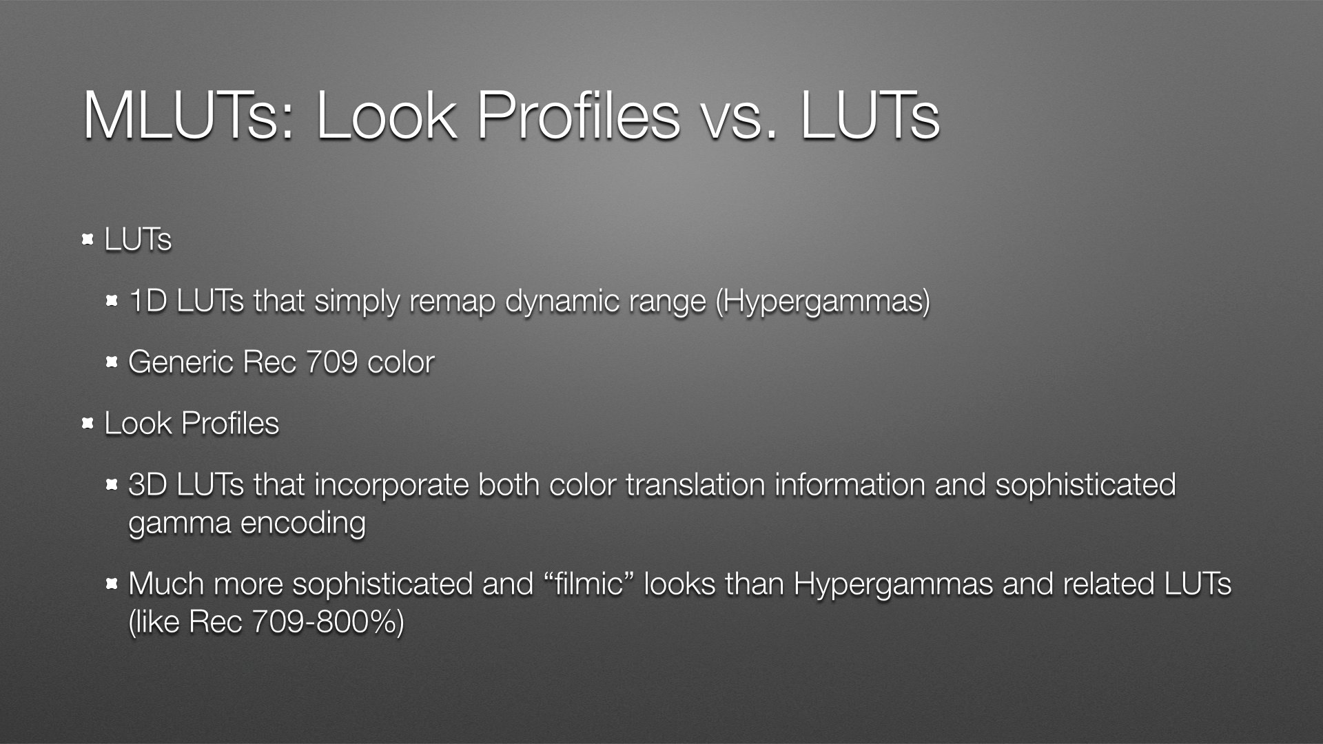
I’m a huge fan of Look Profiles. As they’re only available in Cine EI mode I may never shoot with an F55 in Custom mode again. I’m very comfortable shooting video but I don’t like the traditional video look. I’m officially an Old Film Guy ™, and I much prefer the much more cinematic and sophisticated looks I get from Look Profiles.
I found very little difference, if any, between Look Profiles baked in during shooting and applied during post. I did find that Look Profiles applied to XAVC files look a tad more green than they do applied to raw files. The difference is very subtle and probably has to do with XAVC’s 4:2:2 color subsampling.
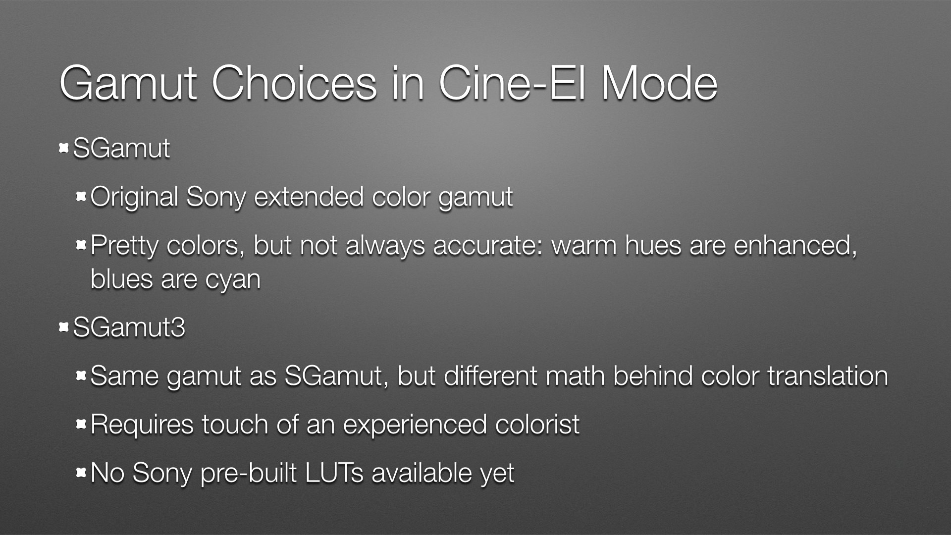
As you saw in the video above, SGamut tends to exaggerate warm hues (red and yellow) while shifting blues toward cyan. This isn’t necessarily a bad look, although it’s not my taste. Nearly all cameras shift cameras in some way: Canon’s line of cameras, for example, renders reds orange and greens cyan.
I’ve not been able to test full-on SGamut3. I’m not an experienced colorist, and SGamut3 is very large and a little rotated compared to the other color gamuts which makes it more difficult to grade without a LUT. (See next slide.) There are no LUTs available for SGamut3 at the moment, although I’m assured they are on their way.
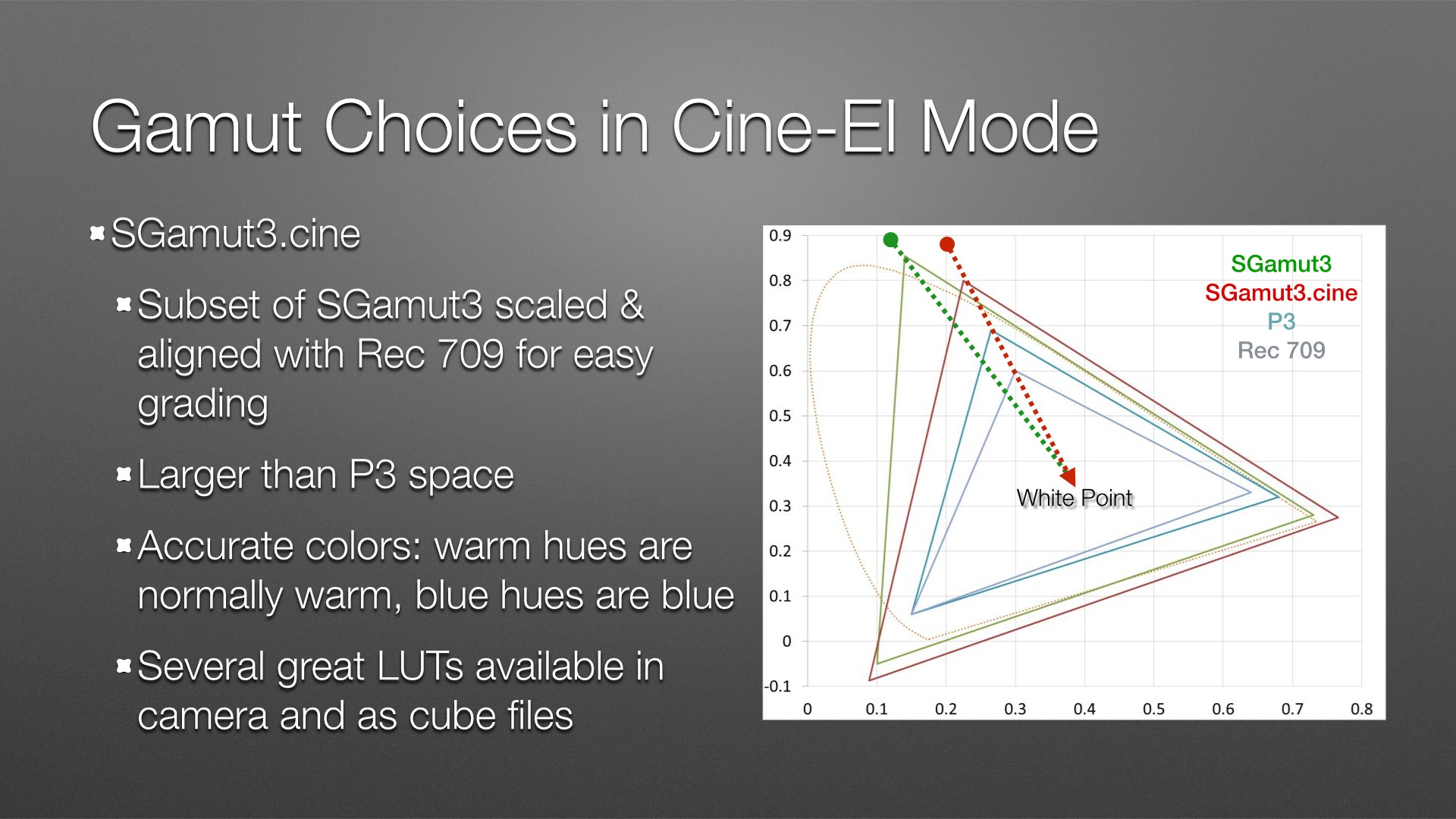
SGamut3.cine is a condensed version of SGamut3. It’s also rotated and scaled in such a way that the green primary aligns with those in Rec 709 and P3. There are several reasons for this:
The official reason, told to me by Sony reps, is that they assumed that all SGamut grading would be done by experienced colorists. They didn’t realize that so much coloring is being done today by relative amateurs, thanks to the wide availability of tools like Blackmagic DaVinci Resolve Lite and RedCine. As SGamut’s green primary is much more saturated than any of the lesser color gamuts, and as it is a different hue relative to Rec 709 and P3 primaries, it can be difficult for an inexperienced colorist to recreate green hues properly in Rec 709 or P3.
Another reason, told to me by someone in the know after my presentation, is that some experienced colorists and DITs prefer not to use LUTs when grading and instead use “traditional” techniques to grade SGamut footage instead. This means they are using lift, gamma, gain and saturation controls to force SGamut into a lesser color space and do the colorist’s bidding. The problem is that this method requires aggressively saturating colors to the point where they become noisy and distorted.
Using a LUT solves this problem by remapping the SGamut values into Rec 709 or P3 values with math instead of brute force, but many colorists and DITs mistrust LUTs for one reason or another.
SGamut3.cine attempts to solve this problem by rotating and scaling SGamut3 into a smaller gamut whose green primary falls on a straight line drawn between the other color gamuts’ common white point and their green primaries. This makes it much easier to grade SGamut3.cine using “traditional” methods, without using a LUT or introducing lots of noise by boosting saturation significantly.
SGamut3.cine is smaller than SGamut3 but is still larger than P3 and much larger than Rec 709. Warm hues are not as punchy as in SGamut and blues are rendered accurately as blue instead of cyan.
I finally learned how hypergammas desaturate color in highlights the night before I gave this presentation. One of the bigger problems when creating looks without using LUTs is how to roll off saturation in highlights before a color channel clips and color distortions occur. For example, if you’re shooting outdoors and blue skies cause the blue channel to clip, the blue channel remains at its maximum value while red and green become more saturated with increased exposure. That means the ratio of blue to green and red changes, with red and green increasing in value while blue remains still. Red and green together make yellow, so an overexposed sky with a clipped blue channel is going to skew yellow unless something is done to compensate.
Hypergammas are 1D LUTs that affect gamma only. They impose S-curves of varying shapes on the color channels, and all of those curves roll off aggressively at the very top portion where highlights live. Because those curves are so compressed the differences between color channels are reduced and become much harder to see, so clipping a color channel doesn’t have much of an impact on overall color anymore.
This is a much more elegant solution than knee circuits were, but still not terribly filmic. Hypergammas were great for their time, but Look Profiles do a much better job overall.
Also, the underlying color of a hypergamma curve is separately controlled by the camera’s color matrix, so color and saturation are handled independently.
Look Profiles are 3D LUTs in which color, gamma and saturation are all adjustable, depending only on the design of the LUT. Rather than control highlight saturation by playing games with curves it’s possible to specify a point beyond which colors simply don’t saturate any further, or become less saturated. We’ll see more of that in just a moment.
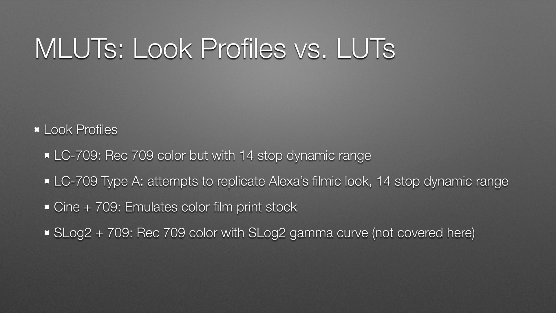
There are four Look Profiles. I understand three of them.
LC-709 is Sony’s generic Rec 709 look. There really isn’t any such thing as a true Rec 709 look anymore as the Rec 709 spec is long outdated; I interpret “Rec 709” as meaning “An image whose colors and gamma will look reasonably good and reasonably accurate on a Rec 709 display,” which is any common HD monitor. Sony’s interpretation of Rec 709 is fairly pretty, although I find that it retains saturation in highlights in a way that I don’t find pleasing… but that’s because I’m an Old Film Guy ™.
LC-709 Type A is the exact same gamma curve as LC-709, but it reproduces color and highlight saturation in a more filmic manner. More on that in a minute.
Cine + 709 is a fairly strong look that attempts to emulate the reduced dynamic range and color shift of color negative film printed onto print stock.
SLog2 + 709 is Rec 709 color (see LC-709) with an SLog2 curve applied. I don’t really use it so I can’t comment on it.
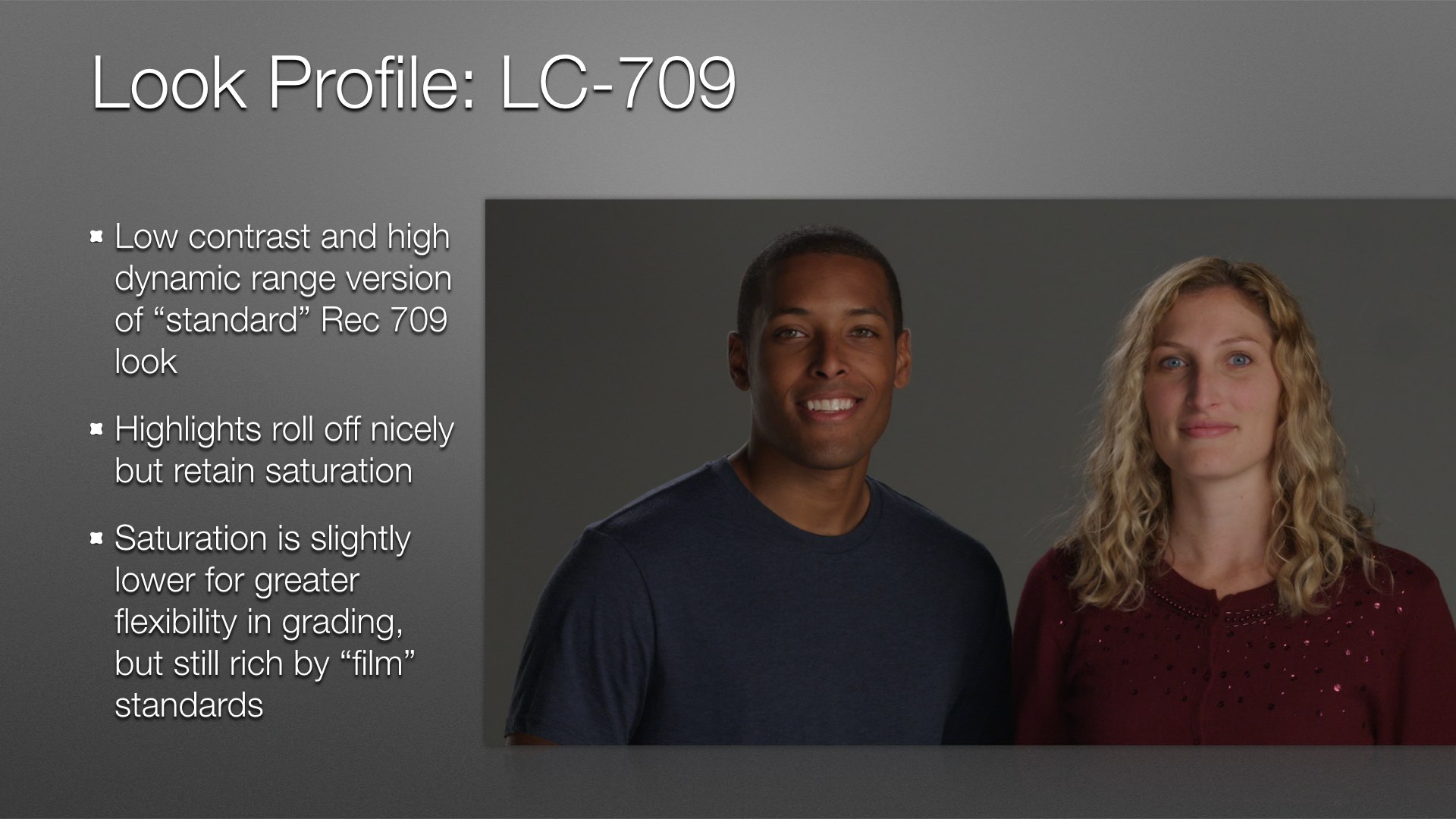
The slide really says it all: LC-709 is a “normal” Rec 709 look built into a 3D LUT. Sony decided to reduce saturation in this LUT to make it harder to clip colors, which makes color grading easier. You can always boost what you have, but you can’t restore what you’ve clipped.
Highlights roll off nicely, and I’ll show that in depth in a future article.
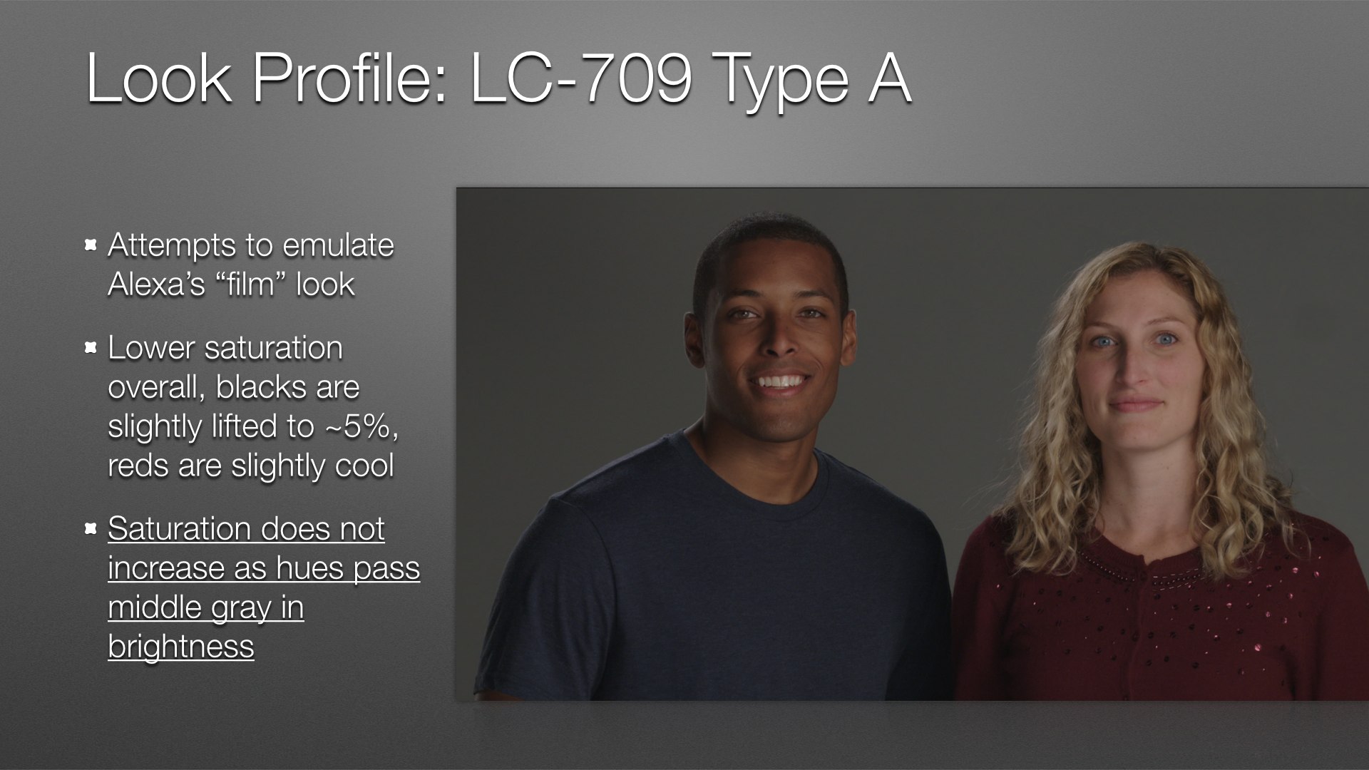
LC-709 Type A is my favorite Look Profile. Flesh tones are amazing–vibrant and alive but not too saturated or artificially enhanced–and highlight saturation is reduced considerably, similar to film.
This gamma curve is exactly the same as LC-709 but the 3D LUT limits saturation to middle gray and below. As exposure increases hues will only become brighter as they pass middle gray, but they won’t become more saturated. This emulates film’s response to color.
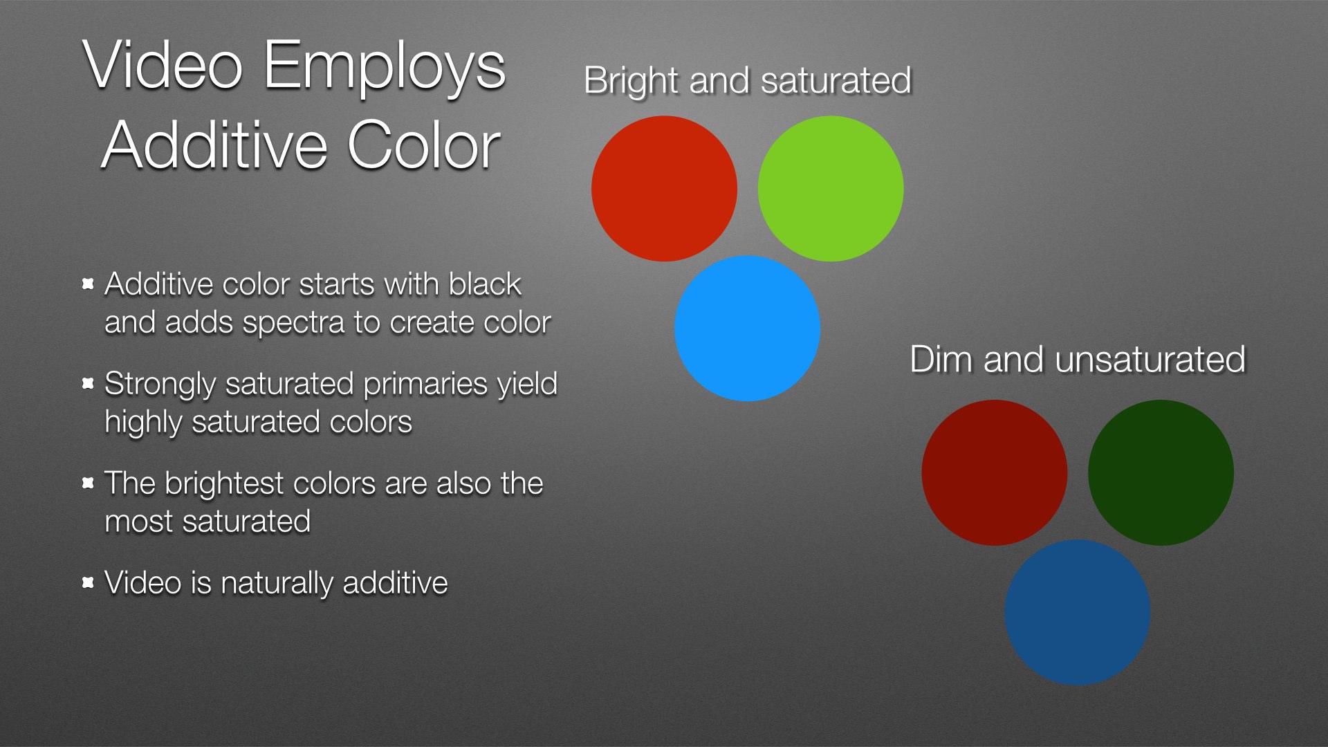
Video is naturally an additive color system, and video manufacturers have always played to this strength. The result of this is the “video look,” where saturation increases with exposure until a color channel clips.
In any additive system the most saturated colors are also the brightest. Saturated but dim colors simply look a bit dull.
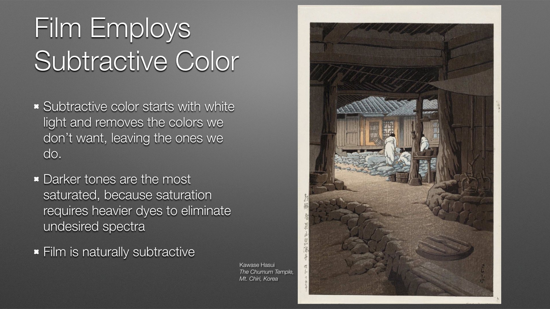
Film is naturally a subtractive color system. It starts with white light pushing its way through a film base, and dyes embedded in the film block portions of the white light spectrum in order to pass only the spectra relevant to that portion of the picture. It’s very similar to watercolor painting, where the artist starts with a white sheet of paper and adds dyes to it until the white light bouncing off the paper is reduced to a smaller portion of the color spectrum to create a specific hue and value.
Lots of paint results in saturated color but also makes the paper less reflective, so the most saturated colors are always the darkest. Film is the same: lots of dye results in deep, rich color, but also reduces the amount of light passing through the film. The darkest hues are the most saturated.
(By the way, I own the print shown on that slide. This is a different copy to mine, as mine is in a frame and I found this image on the Internet, but it’s the pride of my collection. It’s also much richer and more dramatic than this copy, which has been scanned in such a way as to dramatically reduce contrast. The composition is both wonderfully simple and complex.)
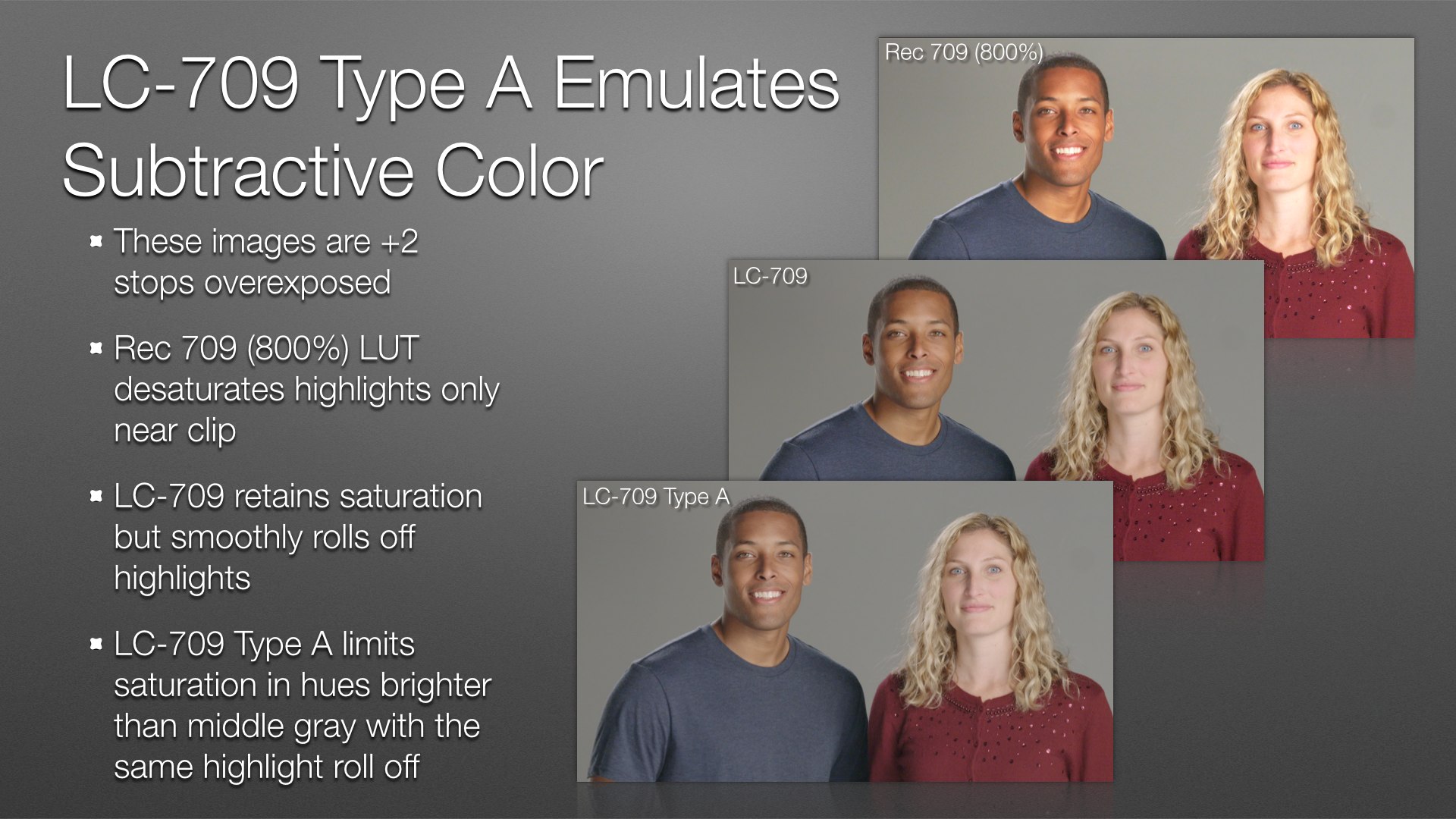
One image on its own rarely illustrates color differences well. It’s always best to have references against which to judge color. In case this I’ve given you three, and I hope the differences are easy to see. (You can click on any of these slides to embiggen them.)
Rec 709 800% is a 1D LUT available in the MLUT section of the video menu, so the underlying color comes from the built-in Rec 709 matrix. Because the 1D LUT reduces highlight saturation by compressing the color channels at the very top of the curve, saturation increases dramatically as exposure increases up to the point where the curves roll off into highlights.
LC-709 is a bit desaturated compared to Rec 709 800% and rolls off highlights in a much gentler curve. In the slide above, William’s face is less oversaturated orange than Rec 709 800% and Kelly’s face looks bright but not overexposed and on the edge of clipping.
LC-709 Type A limits saturation increases beyond middle gray (41% on a luma waveform monitor) so hues become brighter but not more saturated as exposure increases. William’s flesh tones are pleasantly neutral and Kelly’s face looks bright but not overexposed to the point of looking like a mistake. Her sweater is less saturated as well, which better emulates what film would do in a similar situation.
1D LUTs are great for controlling gamma independently of color, but 3D LUTs control color and gamma in unison and can be much more powerful and subtle.
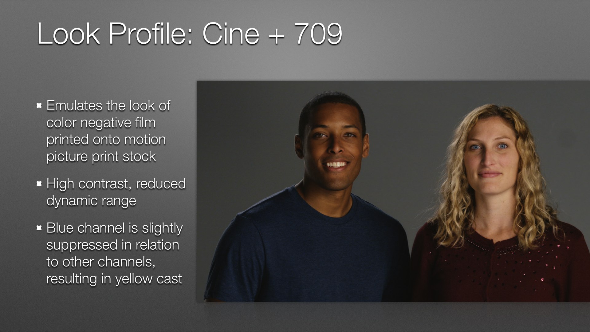
I can’t see baking this look into footage but I can see applying it later and tweaking it for a very punchy and dramatic look.
When I look at this LUT on a parade waveform monitor the blue channel always lags a bit behind the others, which is where the yellow look comes in.
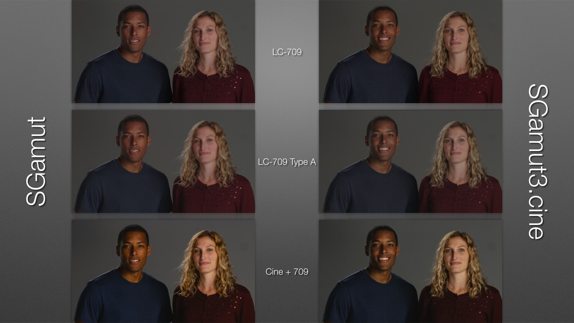
This is a great comparison of SGamut and SGamut3.cine, and a demonstration of how the underlying characteristics of your chosen color gamut always affects the LUT you impose on it. For example, SGamut makes William’s face seem redder than it really is, and it exaggerates the red in Kelly’s face as well as making her appear yellowish in Cine + 709. SGamut3.cine always renders flesh tones more neutral and less red, even in Cine + 709 where warm tones are deliberately emphasized by the yellow cast.
In my next article we’ll look specifically at flesh tones and overexposure. More soon!
About the Author

Director of photography Art Adams knew he wanted to look through cameras for a living at the age of 12. After ten years in Hollywood working on feature films, TV series, commercials, music videos, visual effects and docs he returned to his native San Francisco Bay Area, where he currently shoots commercials and high-end corporate marketing and branding projects.
When Art isn’t shooting he consults on product design and marketing for a number of motion picture equipment manufacturers. His clients have included Sony, Arri, Canon, Tiffen, Schneider Optics, PRG, Cineo Lighting, Element Labs, Sound Devices and DSC Labs.
His writing has appeared in HD Video Pro, American Cinematographer, Australian Cinematographer, Camera Operator Magazine and ProVideo Coalition. He is a current member of the International Cinematographers Guild, and a past active member of the SOC and SMPTE. His website is at www.fearlesslooks.com. Find him on Twitter: @artadams.