
 RED cameras have typically shown more accurate color response under daylight than under tungsten light. Dragon, however, is supposed to be a different beast altogether. Is it? Let’s take a look…
A camera assistant based in Los Angeles told me that he’d been using a Schneider 1/2 CTB filter for tabletop work with RED’s Dragon sensor. “It just doesn’t distinguish between reds and yellows well enough under tungsten light,” he told me. “When you’re shooting a pizza that’s really important.”
I told him I’d run some tests and see what I could find. I hadn’t shot with a Dragon yet, and I hadn’t bothered testing one either.
I was hired to shoot cell phone and tablet screens for a new payment app and the production company bid on the low side in order to get business from a new agency. “We don’t have a lot of money for a camera package,” they told me. “How about a Sony F3?”
Oh, no no no.
The Sony F3 is not one of my favorite cameras. It’s basically a single sensor EX3, with all that entails: video-y color, unpleasant highlight rolloff, and a white balance circuit that likes to make faces look just a little too cyan. None of those things was the deal breaker in this case, however: my problem was that we’d never get closeups of the product screens without receiving a gift basket full of moire each time.
I responded with a sentence that, until recently, I said on very rare occasions indeed: “Get a RED.”
Specifically, I told them to get a Scarlet. I have a sporadic client who owns a Scarlet and it works well enough, other than when the ISO spontaneously decides to take off like a rocket and shoot to 12,500, forcing a reboot, or when we turn it back on after lunch and it’s lost the white balance and ISO settings we shot with all morning. It gets the job done. The one thing I’ve really had success with, though, is using 4K and 5K cameras to shoot screens on small devices. I’ve shot two rounds of “how to use this app” projects for a large dot-com company and on both occasions we shot with RED Epics in 5K HD. The screens looked amazing. I wasn’t particularly happy with flesh tones, but that project was all about interacting with screens so resolution trumped color on that occasion.
Scarlets are cheap, and 4K works great for iPhone screens.
I showed up on the first day of this new app project and found myself staring at a RED Epic Dragon. Surprise! I’d done no testing and had no idea what its quirks were. It was a privately-owned camera that the production company had gotten a deal on, and the gentleman who dropped it off gave me quick some pointers which included, “Never rate it faster than ISO 250.” Yikes. That couldn’t be right! I took a quick look and determined that, while ISO 800 was noisier than I liked, ISO 400 made me perfectly happy.
I shot with it on an insert stage for four days, using client-supplied daylight LED lights, photographing hands touching phone screens. Flesh tones looked pretty good, but I knew that I wasn’t getting a real feel for how the camera responded to light by working with cheapie LEDs.
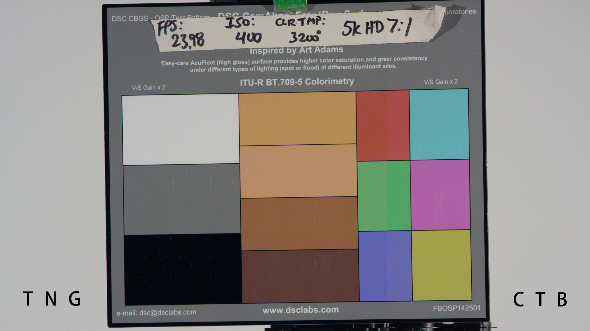
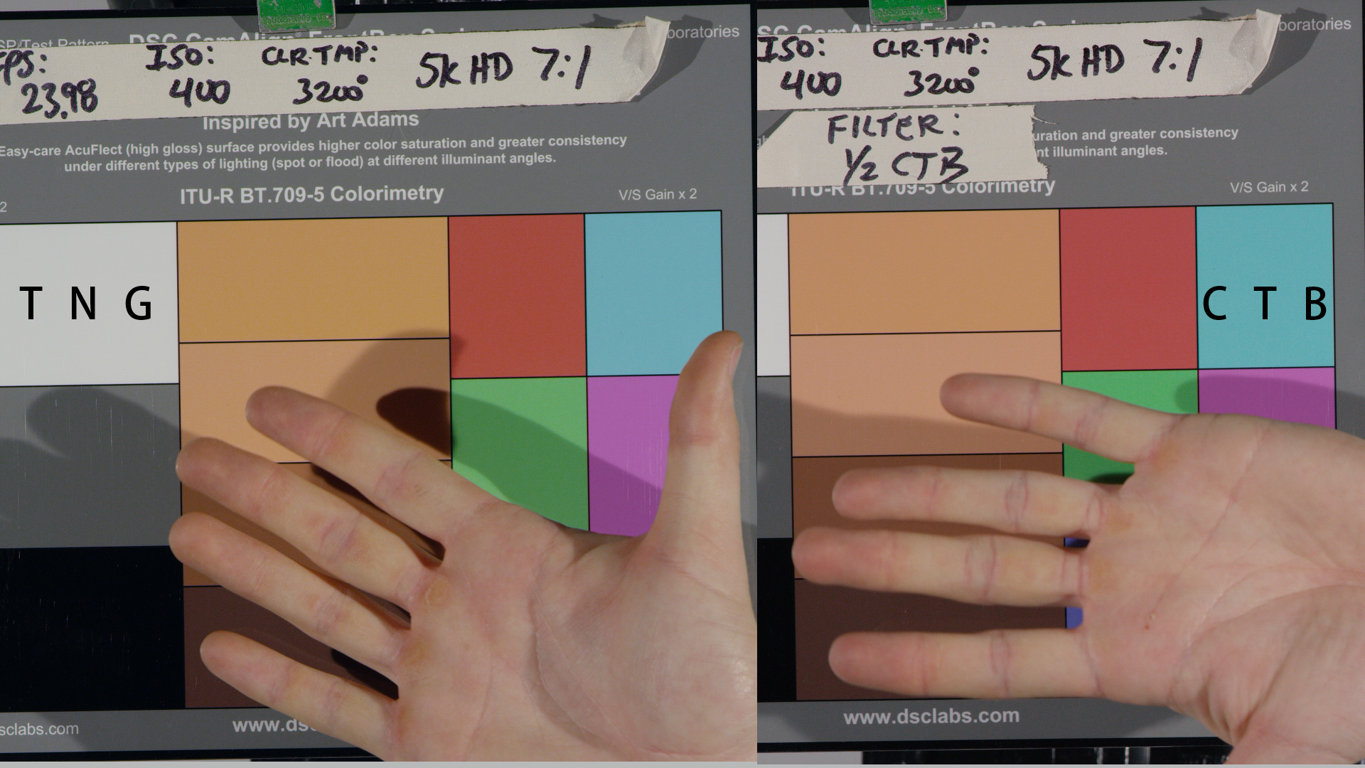
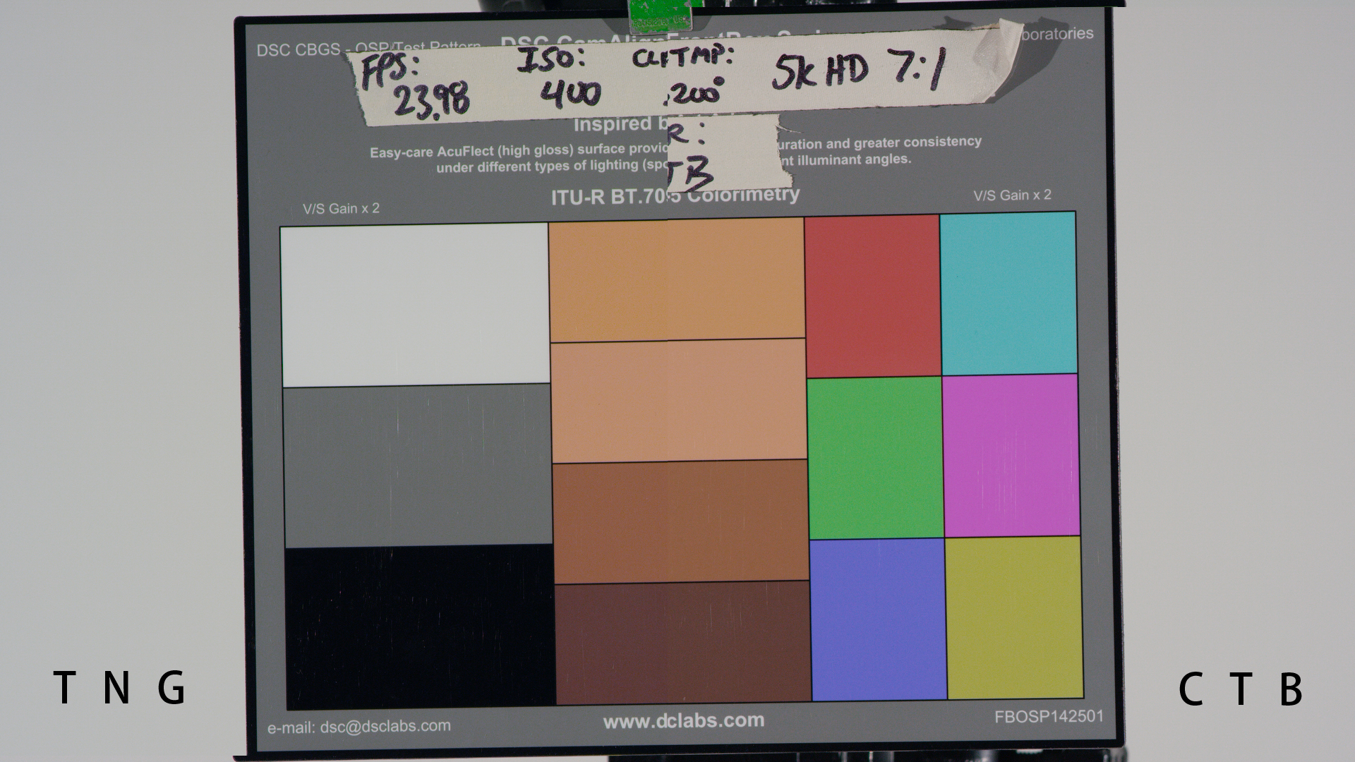
Fast forward to last week, when I showed up to shoot a product instruction video for another client who owned an Epic Dragon. This job was almost all hands interacting with products on a tabletop, and that kind of work typically needs to be done at a pretty small shooting stop for focus reasons. As I was only lighting an area about one foot square I knew I had the option of shooting with either tungsten or partially corrected daylight and getting a decent stop out of both, but before committing one way or the other I shot a quick test. I set up my DSC Labs OneShot Plus chart (designed by yours truly) and rolled four shots:
- Chart alone, lit by tungsten light.
- Chart with a hand in front of it, as a flesh tone reference, under tungsten light.
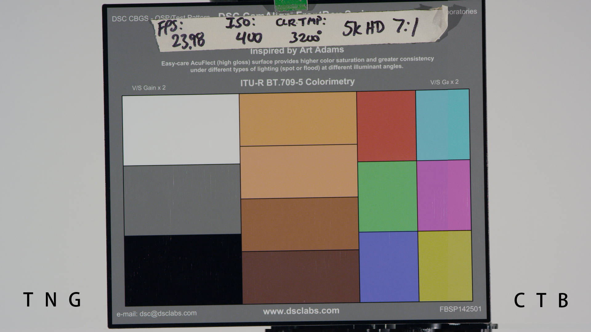
- Chart alone, lit by tungsten light but with a Schneider 1/2 CTB filter in the matte box.
- Chart with a hand in front of it, lit with tungsten light but shot through the 1/2 CTB filter.
My DIT and I ran over to his station, did a quick offload and took a look. We both preferred the 1/2 CTB filtered version, so I shot the project using that filter with the camera set at ISO 400 and my meter at ISO 250. I was generally able to light to a fairly deep stop and flesh tones look pretty good.
After the shoot I decided to take a much closer look at that chart footage. I carry a USB thumb drive on my keychain for just such an occasion (yes, I’m a geek) and my DIT downloaded the relevant clips onto it for further examination.
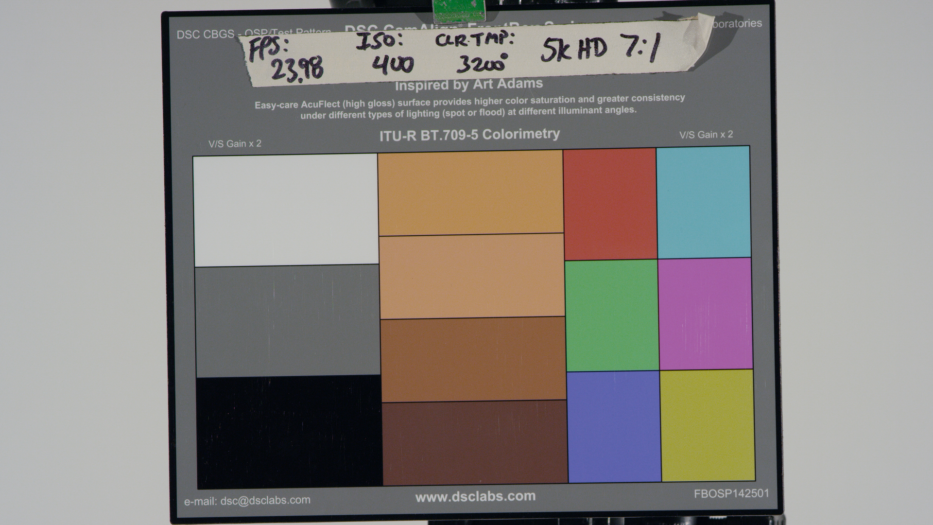
OneShot Plus shot under tungsten light. No filtration.
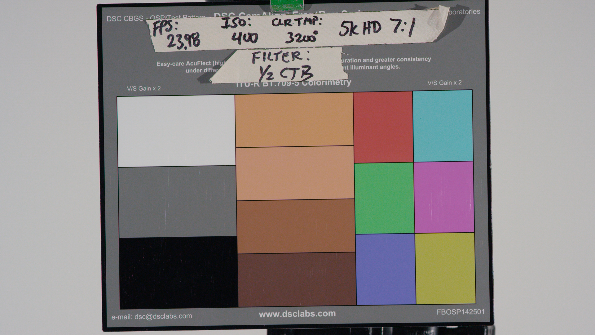
OneShot Plus chart shot under tungsten light, through a Schneider 1/2 CTB filter. Camera white balance read 4500K.
I have to say that I was expecting much worse. At the time, toggling between images on my DIT’s laptop, I thought the differences between the two charts would be much more pronounced than they are. And, on a pre-Dragon sensor, they would have been.
I’ve had a bit of a contentious relationship with RED so I wanted to make sure that I was scrupulously fair in writing this article. Once I got this footage home I tried white balancing both charts using RED’s auto white balance tool in the latest version of RedCine Pro, but I wasn’t happy with the results: they weren’t consistent, with the 1/2 CTB chart looking too blue. Instead I brought the footage into Resolve 11 Lite and white balanced it manually.
I brought up the waveform monitor in RGB parade mode and used the gain wheel to align the tops of the white chip in all three color channels, and then I refined that setting by using the gain sliders and the RGB color picker to get the white chip to within 2-3 points in each color channel. The OneShot Plus is designed specifically for neutralizing dailies and matching footage shot by different cameras in the field, so I had very little trouble making whites, blacks and grays match.
In spite of that, some of the colors looked very different—which is not unusual at all. HD camera color varies normally between tungsten light or daylight. Arri has a great example showing differences in color response between a tungsten-lit reference chart and one lit by HMI, and while an HMI is not perfectly comparable to daylight it gives you an idea of what you can expect. In short, reds and warm colors are much punchier under tungsten light while blue tends to be a bit less saturated, whereas the opposite is true under daylight: blues are punchier, reds are subdued.
Tungsten light is torture for video cameras. Whereas film was most sensitive to blue and least sensitive to red, silicon is totally the opposite. It responds most strongly to energy with long wavelengths, as those penetrate deepest into the surface of the silicon wafer and generate the strongest voltages, so it’s not exaggerating to say that silicon is best at imaging infrared. Humans don’t see infrared, though, so we scrape that part of the spectrum off with IR filters and use what’s left to create pretty pictures. As red light has the longest wavelength in the visible spectrum, silicon sees it best, but blue light—which has the shortest wavelength—doesn’t do much to silicon at all.
Under daylight illumination that’s not a problem as there’s tons of blue light striking the sensor, so it’s the equivalent of hitting the blue photosites with a large hammer. Tungsten light, however, is seriously skewed towards red, so the hammer quickly becomes a very small rock chisel. The blue channel generally requires at least 6db of gain just to make it strong enough to white balance with red and green.
Saturating blue under tungsten light requires all sorts of color and noise compromises, and every camera suffers in one way or another because of this.
Let’s take a closer look at flesh tone under both tungsten light and 4500K light:
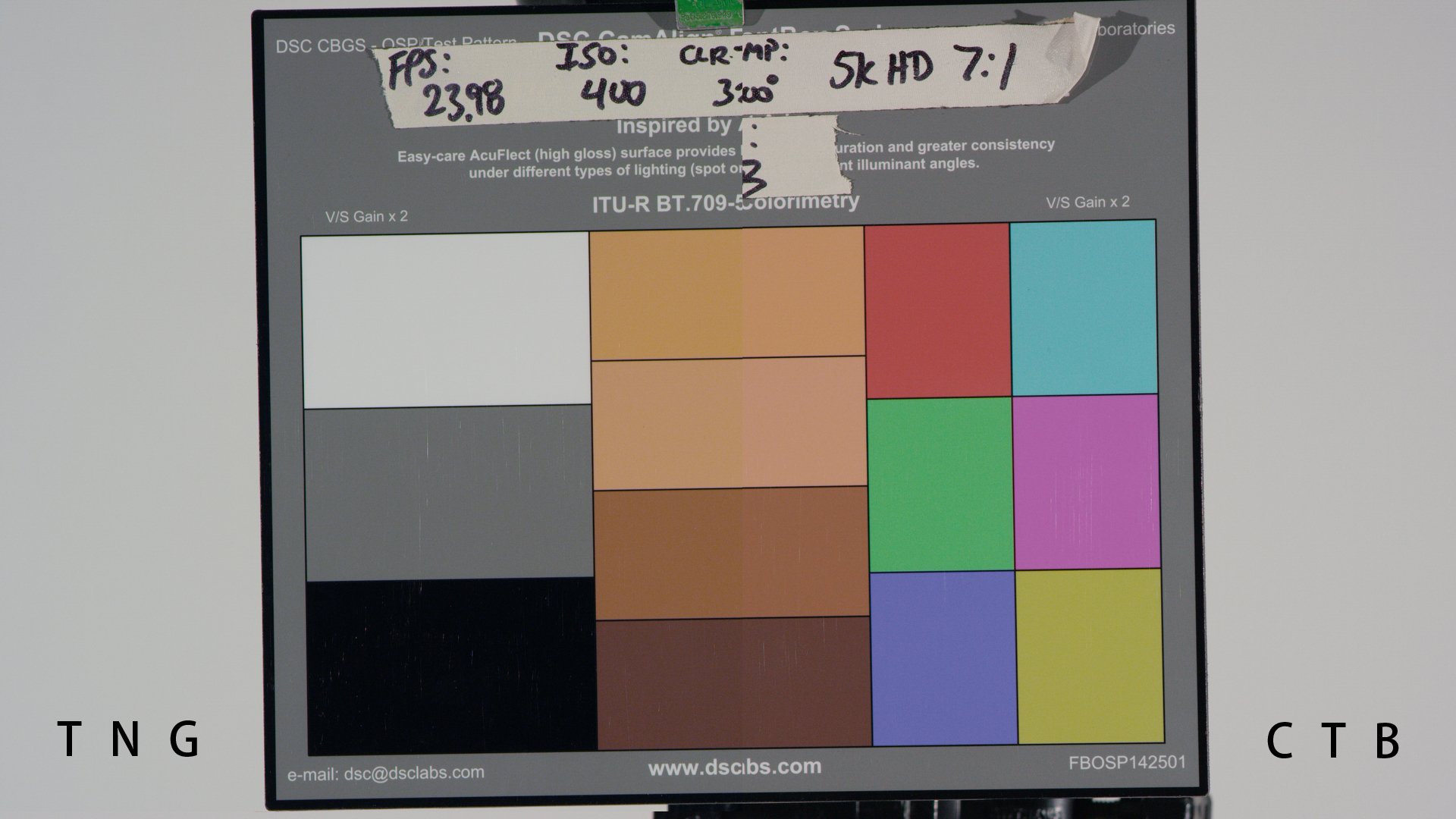
Split screen, on the flesh tone column. Tungsten on the left, 1/2 CTB on the right.
This is a split screen created in Resolve 11. Tungsten is on the left, 4500K (1/2 CTB filtered) light is on the right, and the split screen is right down the middle of the flesh tone column. Honestly, this doesn’t look terrible at all. It’s much better than I’ve seen on previous RED sensors. My biggest complaint is that flesh tone under tungsten light is yellower than I’d like. The flesh tone patches on the right of the split show more subtlety of hues, and my suspicion is this is because blue is better represented under daylight than tungsten. I see this most clearly in the second patch from the top: the tungsten side looks a bit orange, but the right side—with the addition of a little blue—looks a little rosier.
One thing I’ve noticed in other cameras is that making blue saturated under tungsten light can compromise reds and yellows. Saturating a color in a video camera typically means subtracting another color’s signal from it, as the red, green and blue dye filters on the photosites must overlap spectrally in order to resolve hues that fall in between them. Saturating one color requires eliminating the influences of the other colors, and in this process the colors that are subtracted tend to suffer.
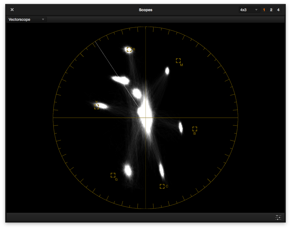
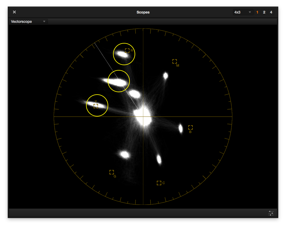
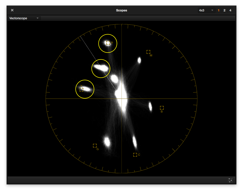
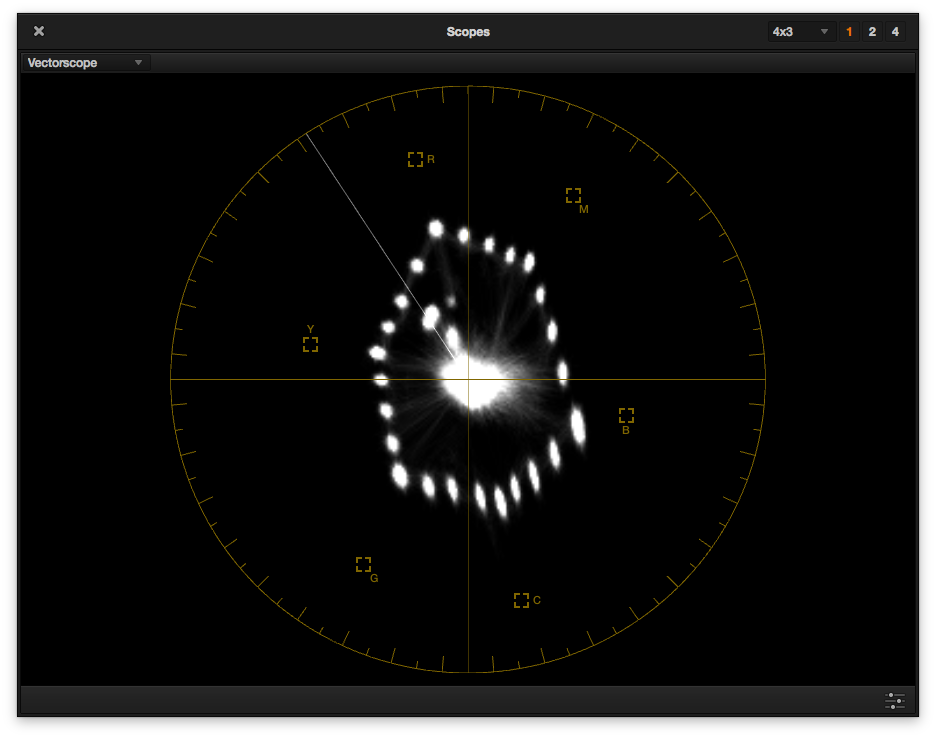
Vectorscope, 1/2 CTB.
This is what the color chart looks like on a vectorscope under 4500K (1/2 CTB filtered) light. Distance from the center tells us how saturated a color is (the farther out a color’s dot is the more saturated it is), and where it falls in relation to the line drawn between the center of the scope and a color target tells us how accurate its hue is (falling on that line, or “vector,” means it is accurate). That white line between red (top, near 11:30 o’clock) and yellow (near 9:30 o’clock) is where flesh tone typically falls. At 2x gain (or magnification) the dots should—theoretically—fall in their boxes. They never do—with any camera— but they should at least fall on the proper vector.
In this case, red is dead on and yellow is close enough. Green looks like it’s going a little blueish, while, cyan, blue and magenta look to be largely accurate if slightly undersaturated. What’s interesting is that one of the patches on the flesh tone line has a tail, and I don’t normally consider that a good thing.
Ideally each color should be a small, round dot. That means that its corresponding patch on the color chart is being read as a discrete color, not a range of hues mushed together. The comet tail on the brightest flesh tone patch shows that the camera is seeing that one hue as a range of hues, which is not generally a good thing as the camera may not be able to see subtle hues across a range of skin tones. Still, it’s only the brightest patch that is doing this (I zoomed in to the flesh tone column in Resolve and determined this was the case) so I’m not completely bothered.
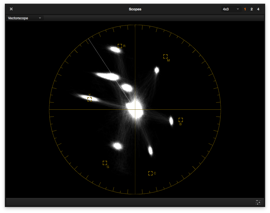
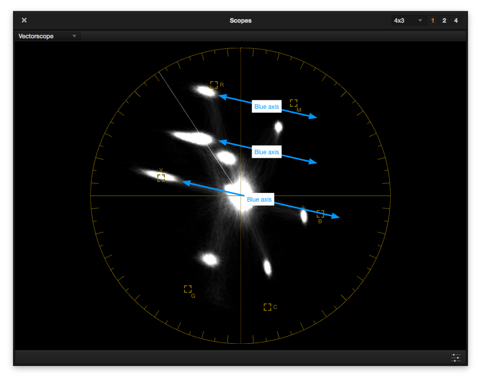
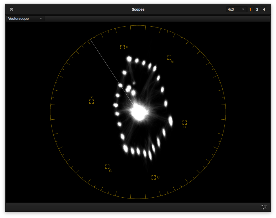
Vectorscope, tungsten light.
Here’s what the scope looks like under tungsten light. The comet tail on the brightest flesh tone patch has become quite long. Yellow is still accurate but heavily smeared away from blue, and red is pulling slightly toward yellow, making it just a touch orange. Green is accurate, as is magenta (no surprise there as they are complements) but blue is a just a little bit greenish.
Let’s see if the vectorscopes predict what the images will look like. Once again, here’s the flesh tone split screen:
Split screen: flesh tone column.
Yup, flesh tones under tungsten pull a little toward the yellow side. Let’s look at the next column over:
Split screen: red, green and blue column.
This time the red/green/blue column is split. The only surprise here is that red is much more saturated and pure under 4500K light, which is not what I’d normally expect. Green is definitely bluer under 4500K light and blue is less saturated.
Split screen: cyan, magenta and yellow column.
Looking at the last column, cyan/magenta/yellow, all three colors seem very slightly richer in 4500K light.
If you clicked through to the Alexa tungsten-vs.-HMI comparison I linked to above, it won’t be any surprise that there’s this much difference between tungsten light and tungsten light filtered with 1/2 CTB. I’ve seen shifts like this on every camera I’ve tested, including the Arri Alexa, Canon C300, and Sony F5/F55. The Mysterium and Mysterium-X sensors were definite outliers when it came to shooting under different colors of light, but Dragon truly seems to be different—and fairly normal. My one concern, though, is flesh tone. I’m used to seeing different levels of saturation under different light sources on other cameras, but not a hue shift.
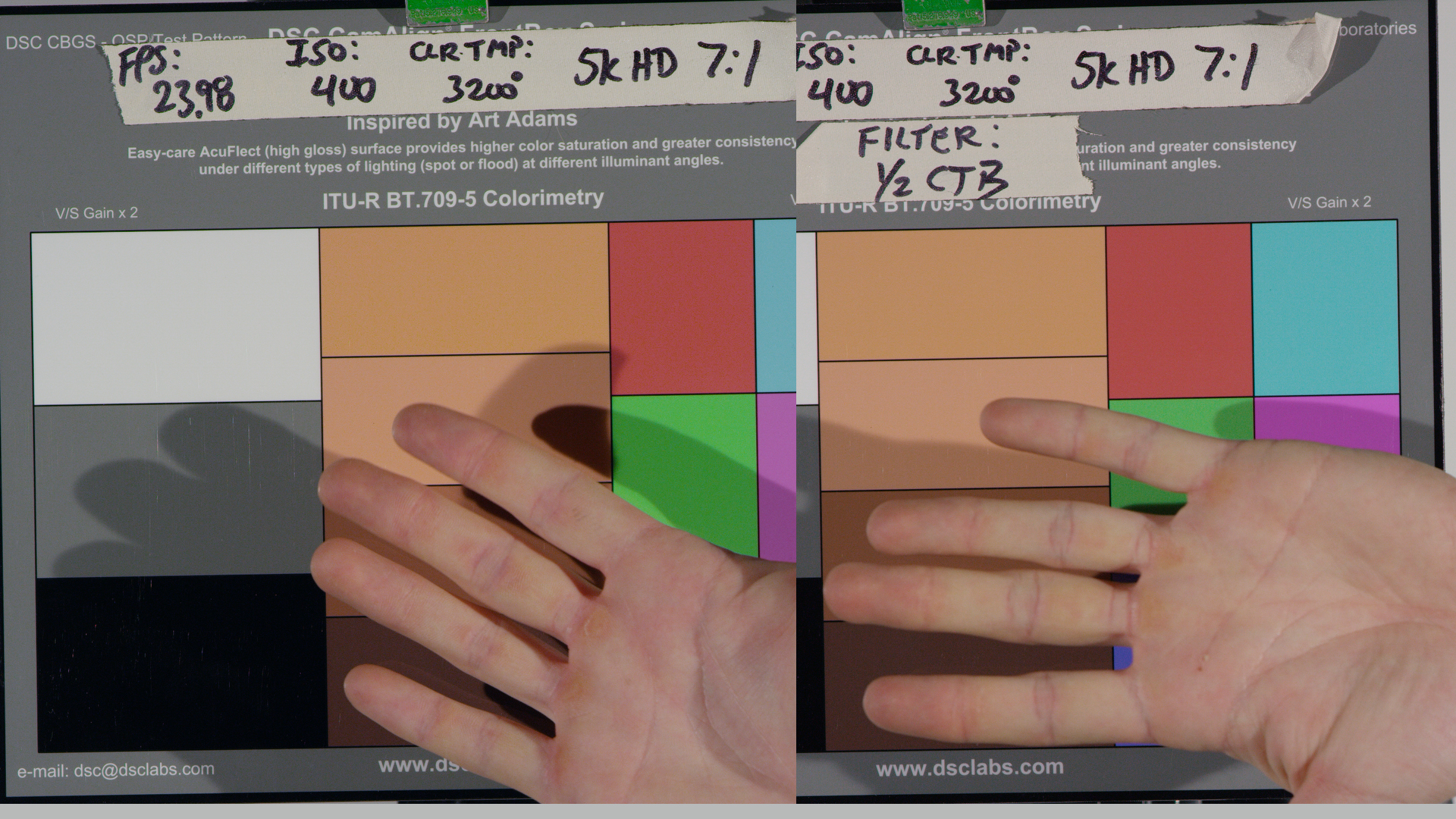
It’s one thing to look at charts, though, and another to look at reality. Here’s my DIT’s hand:
 I’ve been told that I’m pickier about color than a lot of other people are, and initially this comparison really bothered me… but the more I look at it the less concerned I am. Yes, the flesh tone on the left is a little yellower than the one on the right. Yes, I like the flesh tone on the right more. Is this a deal breaker? Not really. I’m not sure I would have noticed the difference without this comparison.
I knew something had to be happening in the blue channel as the flesh tone patches on the right clearly have more blue in them, resulting in a look that’s considerably less warm. A look at the parade RGB waveform in Resolve was very revealing:
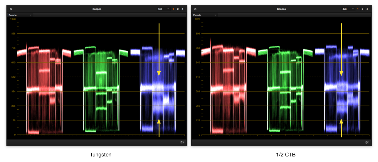 The four flesh tone patches on the chart fall between the two yellow arrows. Under tungsten those four tones mush together into two fuzzy blobs, but with 1/2 CTB filtration the four tones are easily discernible.
Okay, this is where the high geekery starts:
If you’ve ever looked deep into the menu of a Sony, Panasonic or Canon camera you’ve seen something called the “user matrix.” It has a number of settings that look like R-G, R-B, G-R, G-B, B-R and B-G. For a decade and a half I asked people what the hell those settings did, and the best answer I got was “they mess with the color.” Once I learned that colors are formed in the camera by subtracting the overlapping color signals from each other I realized that these settings do exactly what they say they do: R-G means, literally, red minus green. That control affects how much the green signal is subtracted from the red signal.
All these settings interact so they aren’t easy to tweak. Subtracting red from blue, for example, seems like a good idea under tungsten light because that will make blue more saturated. The problem, though, is that any hue containing red gets pushed the opposite direction from blue, and off its vector. It becomes a different color. Also, the more one color is subtracted from another the more distorted red becomes. Here’s what I’m talking about:
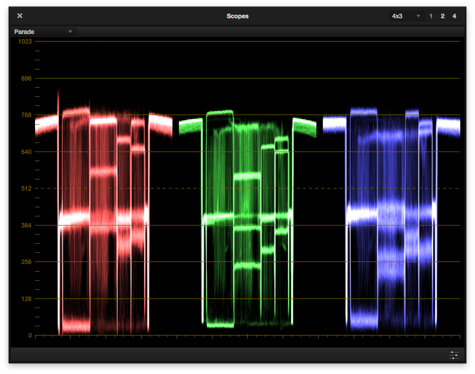
Under tungsten light the circled patches are, top to bottom: red; the brightest two flesh tone patches; and yellow. Notice how distorted they are.
With 1/2 CTB filtration the distortions are vastly reduced. Distortion in red is nearly gone, and it’s actually on its vector now so it will appear as a true red.
Tungsten light again. Trying to make blue saturated—moving it away from the center of the scope—requires subtracting red from its signal. That pushes any color containing red away from blue and causing it to smear along an axis parallel to blue’s. Notice how the red, yellow and flesh tone patches smear along lines that are parallel to blue’s vector.
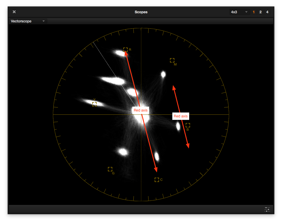
Also, under tungsten light, we can see that some blue is being subtracted from the red channel, resulting in minor distortion to the blue channel as it is smearing along a line that is parallel to red’s vector.
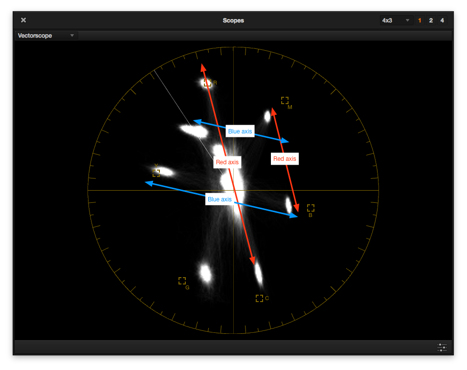
Under 1/2 CTB filtration we can see that the B-R distortion (blue lines), which affects red, yellow and flesh tone, is much less, while R-B distortion (red lines) has caused blue and cyan to smear a fair bit. There’s more blue in daylight so there’s less need to saturate it, which reduces stress on red, yellow and flesh tones. At the same time there’s less red, so saturating red distorts blue and cyan.
A smeared color patch means that hues along that smear will all look the same. There won’t be much subtlety between hues.
For comparison, I pulled up some footage I shot recently using an Arri Amira and a DSC Labs Chroma Du Monde chart. Here’s how they looked on a vectorscope:
This is the Arri Amira under daylight. The Chroma Du Monde has more color patches than the OneShot Plus as it’s meant for video engineering and not simply dailies, but the idea is the same. The four corners of the hexagon are red, magenta, blue, cyan, green and yellow, and correspond to the same colors seen in the OneShot Plus. Note how the hues are very small discrete dots, where Dragon’s hues are larger in size. I see some smearing in the blue patch and a little bit on the green, which tells me that both are being subtracted from red to increase red’s saturation, but overall there’s very little hue distortion.
This is the same pattern under tungsten light. There’s not a lot of difference beyond the fact that more blue is being subtracted from red as the blue and cyan patches show a bit more smear, yellow saturation is considerably reduced.
Amira color seems to be much cleaner and more discrete, but at the same time we can see many of the same distortions that appear in Dragon’s color—but on a much smaller scale.
I wanted to see if I, as an amateur colorist, could grade tungsten flesh tones to match the 4500K flesh tones that I like so much. I went into Resolve’s Hue vs. Hue and Hue vs. Sat editors and made some gross corrections:
Split screen down the flesh tone column. I got very, very close here.
Here’s the ungraded comparison, with tungsten on the left and 1/2 CTB on the right.
Here’s my graded tungsten version. The color patches match but flesh tone doesn’t. The reddish parts of the hand have tipped a little past red into magenta, which isn’t a great look.
Just pushing flesh tone and red around doesn’t always do the trick. I ran into a similar problem when working with Canon C300 footage. Canon’s red skews toward orange in nearly all their matrices and under both tungsten and daylight (unlike Dragon, where it only happens under tungsten light) and trying to correct red while retaining accurate flesh tones is nearly impossible to do in camera. I suspect the same may be true here: under tungsten light you can have accurate flesh tones or accurate reds, but not both at the same time—unless you’re working with a very good colorist.
So, in the end, the assistant who told me that reds and yellows don’t co-exist well under tungsten light seems to have it right, but I’m not sure that this makes much difference in most circumstances. For color critical tabletop work adding 1/2 CTB may make sense, but for general shooting I don’t think Dragon requires daylight for accurate color rendition anymore. I don’t see anything here that a competent colorist couldn’t fix or enhance.
The one thing that does bother me is that I don’t see the subtlety of hues that I do on an Alexa or Amira, as revealed by the vectorscope images that show Amira’s hues to be very fine dots while Dragon’s tend to be bigger and, in some cases, have long tails that sweep across many hues. Still, Dragon is clearly a huge improvement and, at least with the “highlight and skin tone” OLPF package tested here, renders color in a generally accurate manner, if not with finely detailed subtlety.
After so many years of having to avoid using tungsten light with RED cameras it’ll be nice to take Dragon out and not worry terribly much using special filters or certain colors of light. It’ll just be another camera choice, and a welcome one.
Disclosure: I have worked as a paid consultant to DSC Labs, makers of the OneShot Plus and Chroma Du Monde charts.