Color is something that has fascinated me for a long time.
This is what I’ve noticed about trends in cameras over the years.
 When I started out in this business as a camera assistant every film stock had a signature. Companies had overall looks — Kodak was the “warm” company, Fuji was the “cool” company, etc. — but each stock had its own personality.
Kodak was known for warm and cozy film stocks that emphasized healthy flesh tones. Occasionally a stock came out that went a bit too far, as was the case with an early high speed stock that made shadows a bit too red, and it wasn’t hard to create moody cool looks, but generally Kodak stocks had a lot of red and orange in them.
Fuji was much, much cooler by comparison. I’ve been been told that the Japanese prefer cool tones the way we prefer warm, and this stock seemed to reflect that. Blues and greens predominated, and while flesh tones didn’t look unpleasant they didn’t look overly warm and healthy the way Kodak’s did. They just made people look… normal. For some — those who were tired of Kodak’s warmth — Fuji was a wonderful alternative.
French company Agfa-Geveart made stocks with very muted color palettes. Kodak was known for fairly vivid color, with Fuji a little less so, so Agfa offered a strong counterpoint by offering low contrast stocks with subdued color palettes.
Eventually Kodak made most of its stocks neutral in color response and similar except for grain, in order to maximize control in the DI process and ensure that its stocks cut together seamlessly. Some DPs like this, but others switched to Fuji so they could create stronger looks in-camera. Now Kodak is the only real choice for color negative film as Fuji no longer makes film and Agfa stopped in the ’90s.
Video cameras are very similar. Each company has a base look, and in some cases this look has evolved over time. I’ve been working with Sony on developing a new filmic look for the Sony F55 so I’ve spent a lot of time pondering color palettes and trying to figure out what it is that I like, or dislike, about various cameras over the years. Here’s the short version, illustrated with images from projects that I’ve shot (as available).
Ikegami
When I first started working in video I dealt primarily with equipment from rental houses, who all seemed to stock Sony products. Owner/operators tended toward Ikegami, however, and I found this curious. As I gained more experience with Ikegami cameras I found that I quite liked them: their flesh tones were gorgeous and the overall color palette was a little on the cool side. Sony cameras of that era tended to warm everything up, especially flesh tones, and Ikegami rendered flesh tones as naturally warm with no further enhancement.
Sony was the electronic version of Kodak film, while Ikegami was similar to Fuji film.
I was told by a couple of Ikegami owner / operators that getting Ikegami equipment repaired and serviced was not the easiest thing in the world but they were willing to go through a little extra pain for a look they really liked. Sony provided excellent support, especially to companies that owned a lot of their gear, so rental houses opted to go that route for business reasons. Also, no one ever got fired for showing up with a Sony camera.
Panasonic
Panasonic changed everything when they released the SDX-900, a standard definition camera that emulated film’s 3:2 pulldown in camera for a filmic look. What really sold it was its colorimetry, which was stunning for the time. Flesh tones were rich without being overly warm and made everyone look astoundingly healthy. Somehow Panasonic could reproduce accurate and beautiful secondary colors that other cameras couldn’t touch, like purple and yellow. This trend continued in the original Varicam, an HD camera that only captured 720p but was immensely popular because the picture looked so good that many were willing to give up 1080p resolution in favor of amazing color.
A year or two ago I shot a series of spots in the style of a multi-camera cooking show. We used two Panasonic HDX-900 cameras, and while they were a pain to light for (their overexposure latitude was extremely limited and I had to use dots and fingers all over the set to prevent white objects from blowing out) they made the set look like a watercolor painting. The clients kept commenting on how beautiful everything looked. We shot in a kitchen lined with muted green tiles and their color was dead-on perfect on the monitors. Most cameras would distort them by making them more saturated or shifting them a little toward blue, but what we saw by eye is what the cameras saw as well.

Panasonic took the market by storm with its beautiful but subdued flesh tones and rich, accurate secondary colors. Unfortunately background highlights required a lot of flagging due to limited dynamic range. There’s something about this image that feels “painterly” to me. Shot on a Panasonic HDX900 using one of the “Filmlike” gamma curves under tungsten light.
Sadly, Panasonic stumbled badly with the AF-100 and has never recovered. Their HD-SLMs seem to be quite popular but I don’t have much experience with them. I keep hoping for a 4K Varicam just to have that beautiful Panasonic look in a high-res camera but I’m not holding my breath.
Editor’s note: Art doesn’t have to hold his breath; Panasonic has indeed announced a 4K Varicam for NAB2014 — Art wrote this article prior to that press release.
RED Digital Cinema
The early RED cameras didn’t look so great. They were released early as “alphas” pending software updates, and that was quite an education as I was able to watch a camera virtually assembled before my eyes. The colorimetry changed dramatically from build to build, and that was my first lesson in how important image processing is to a camera’s soul.
I’m anxiously awaiting a look at the new Dragon sensor as I’ve never been happy with how the M and MX sensors rendered color. The red channel seemed way too sensitive and did bad things to flesh tone under tungsten light, making people look ruddy and plastic-like. While the color science has improved significantly over the years I’m still not happy with how the cameras handle flesh tones, even under daylight. I don’t remember the last time I shot with a RED under tungsten light without filtering the lights or the camera. (I tried that once. Once.)
Early software builds added a lot of blue to the green channel under tungsten light, turning green screens cyan and adding a little bit of coolness to greens, yellows and reds. Build 30 marked a turning point where RED’s color improved dramatically, and I remember shooting a spot where I mixed tungsten and daylight under a daylight white balanced and the tungsten light looked great! Many cameras will see tungsten light as very yellow or even yellow-green under a daylight white balance, and the effect screams “video” to me.
One thing I’ve noticed about RED images is that they work best with overall color correction. A lot of movies and TV shows shot on REDs seem to use overall color casts to express mood, and while this isn’t unusual in filmmaking it seems to happen more with RED footage.

The foreground is graded a touch yellow-green while the background is slightly cyan, creating a marvelous layered effect. Shot on a RED One M, rated at ISO 160, under HMI light.

This is a still from the first project I shot on a RED camera. RED One M, ISO 160, tungsten light with 1/2 CTB added. The overall color grade is a bit chocolate to get a nostalgic look.
RED’s priority seems to be on resolution over everything else, as the only difference between the RED One M/MX and the Epic has been sensor size and resolution, not colorimetry. My emphasis has always been on color over resolution. My hope is that Dragon changes that, but it looks like it’ll be a long time until I can get my hands on one.
Canon
Canon’s color seems to be based on color science it developed for its DSLR lineup, which isn’t terribly surprising. When asked about color a Canon rep once told me, “It’s all about flesh tone. All other colors are secondary.”
This seems to be true, although it’s not necessarily a bad thing. Canon reproduces reds as reddish orange, apparently to help blend blemishes into skin and make flesh look warmer and richer. (Most blemishes are redder than skin is, so by shifting their color back toward orange they disappear.) Canon greens tend to skew blue, which makes life exciting for anyone who’s ever tried shooting a green screen with a C300 or 5D, and it took me a long time to figure out why this was desirable. One day, while shooting a shot in a field with the Golden Gate Bridge in the background, I discovered that EOS Standard was the only color matrix that made the bridge the proper shade of orange-ish red. All the other matrices made the bridge a flat orange color. EOS Standard was the only matrix I could find that actually reproduce color accurately, but what I discovered was the grass became such a rich green that it distracted from the people I was shooting. Selecting another matrix made the grass blueish but the people stood out better in a classic warm-vs.-cool contrast. That was an interesting discovery.

Shot with a Canon C300, EOS Standard matrix with heavy, heavy desaturation. This is the only way I could make the bridge look the proper color and create the subdued color look I love so much, as EOS Standard is VERY saturated.
In the end I went with EOS Standard as the color of the bridge is quite iconic and it would be weird for a regional commercial to show it as having the wrong color.
My biggest issue is that bright highlights show color fringing in every C300 color matrix but EOS Standard, which gives blown-out windows and backgrounds a very old school video look that I hate. EOS Standard is a wonderful matrix but for the fact that it’s incredibly saturated. Often I end up shooting in Cinema1 or Cinema2 matrix and adjusting the saturation manually, which gives me flesh tones that aren’t too crazy saturated but causes color fringing around highlights.

In this talking head video, which I shot under HMI light with a Canon C300, I took a different route and used one of the Cinema matrices for subdued but pretty flesh tones. Unfortunately this color matrix adds cyan fringes around bright highlights. The splotches of light in the background are windows looking north into sunny downtown San Francisco. I’m told that Canon’s latest firmware contains a Wide Dynamic Range mode that desaturates highlights above 70%, which should eliminate this problem.
Sony
I have a LOT of experience with Sony cameras. When I first started shooting video they were all I knew. Over time I worked with Ikegami cameras as well as Thompson/BTS cameras (which had a similar look), and as much as I liked their look I found myself working most often through rental houses and using their stock Sony cameras.

This was shot with a Sony EX3. The EX cameras and F3 leaned a bit on the cool side with their white balance and made flesh tones look too cool, so we commonly white balanced through 1/4 CTB and 1/8 plus green gel to warm up and add red to flesh tones. This was a common trick in the analog camcorder days as well, although only with Sony cameras. I’m quite pleased with this image, it’s very rich and pretty—but it’s definitely not a “filmic” look.
Sony cameras had a number of weaknesses when it came to color. Reds were most often a bit orange, an apparent legacy of the Sony Trinitron TV line (or so a Sony salesperson once told me; red phosphors in early CRT sets weren’t bright enough compared to blue and green, so some green phosphor was added to red to make it a little brighter). Secondary colors didn’t read well at all: for example, objects that were cyan or purple most often simply turned blue. The cameras were so blue sensitive that it was impossible to shoot in a mixed tungsten/daylight environment with a tungsten white balance as any hint of daylight became electric blue. Resetting white balance for daylight rendered tungsten light as yellow-green.
The Sony F900 was the first widely-used mass market HD camera, and while it looked really good for the time its color reflected its SD roots. The F900R, however, departed significantly from the old Sony look. I can’t remember the specifics now but I remember being struck by how secondary colors were more accurately and subtly rendered. Reds seemed more accurate and blues were a bit less crazy.
I saw further changes in the F35. During a spec pot shot in a house in San Francisco I found my video engineer staring at a Persian rug on the engineering monitor and muttering, “I’ve never seen such amazing reds before.” The color red in standard definition was always the bastard stepchild: it was never the proper color, or many subtle hues of red were crushed into one generic red wash. The F35 captured all those hues and managed to reproduce them accurately on a Rec 709 display. That was pretty amazing for the time.
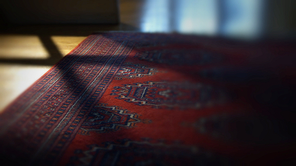
Also, shooting daylight under a tungsten white balance looked very different. Daylight read as a much softer and more pleasant blue than I’d seen in previous Sony cameras, and I stopped being afraid of shooting tungsten interiors with a little daylight coming through the windows.
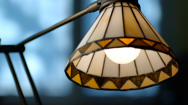
Sony F35 balanced for tungsten light, with daylight in the background. It really is a beautiful looking camera.
I didn’t know this at the time but I was seeing the benefits of a camera with a wide color gamut sensor. Apparently all single sensor cameras are automatically wide gamut: three-chip prism cameras pass very narrow swathes of red, green and blue and it is difficult to manufacture prisms that pass the broader notches of spectrum necessary to reproduce a wider color gamut, while it’s actually difficult to do the opposite with single sensor cameras. The dyes on single sensor photo sites seem to be automatically wide gamut friendly.
Working with a wider color gamut means the camera is able to see color in a manner similar to what the human eye sees, while prism cameras tend to have significant gaps in the colors they can see which reduces the accuracy of secondary colors. (Panasonic was the only company that made prism cameras that saw secondary colors really, really well.)
There’s an interesting side effect to this: the broader bandpasses of the dye filters used in single sensor cameras made them susceptible to severe color shifts under broken spectrum light sources. Fluorescent lights, for example, show a massive spike in the green portion of the spectrum that film sees but prism cameras don’t, as the spike falls into a color “blind spot” created by the narrow bandpasses of the prism filters. I often used unfiltered tungsten lights in warm white fluorescent environments and they mixed very well when shot with prism cameras. Single sensor cameras see that green spike in the same way film does, which means either replacing fluorescent tubes with color correct lamps or gelling tungsten lights green to match.
I first noticed this effect on the RED One, but the F35 was susceptible as well. I don’t know of a single sensor camera that doesn’t see fluorescent lights this way.
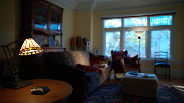
The thing that prevents the image above from looking “filmic” is that the highlights are too saturated. The blues and greens outside the window are much more saturated than film would allow. There’s a new look profile in the F55, LC-709 Type A, that reduces highlight saturation in a film-like manner. I’m quite excited to see how it works with their new SGamut3 color science, especially as I contributed a little bit to Type A’s development.
The impetus for this was one company’s success in emulating the “film look” and killing film forever…
Arri
I never worked with the D20 or D21. I heard they looked fabulous, although the early versions had some highlight handling issues and apparently they were enormously heavy. I know a director/DP who shot a wonderful handheld low angle shot of a kid fly fishing in a river with a D21 for a commercial but as he couldn’t support the camera himself he had the key grip help him. They each took a side!
Arri is never first to market with anything, but when they show up they tend to do things better than anyone else. While the Alexa is a saturated camera if you look at it on a color chart it doesn’t look that way on set, and the reason seems to be that they roll off saturation in the highlights the way film does. Once luma passes 40% on a waveform the color saturation locks in place, so hues only get brighter and not more saturated. This is a huge improvement over the traditional “video look” that many of us have been trying to get away from for a while.
The first time I shot a night exterior I found myself working extra hard to make the moonlight source look blue enough. Arri’s blue is so soft and gentle that it threw me off my game! It was much more filmic and much less like vide—it’s easy to create a bright, saturated blue on video but impossible on film, which Alexa attempts to emulate—but I had a hard time creating a really saturated moonlight source that was appropriate for the energy of the spot. Instead of adding ½ CTB and ¼ plus green to my lights, as I would with a Sony camera, I had to use full CTB and ½ plus green! Still, the look is amazing and something I’ve not been able to recreate on other cameras.
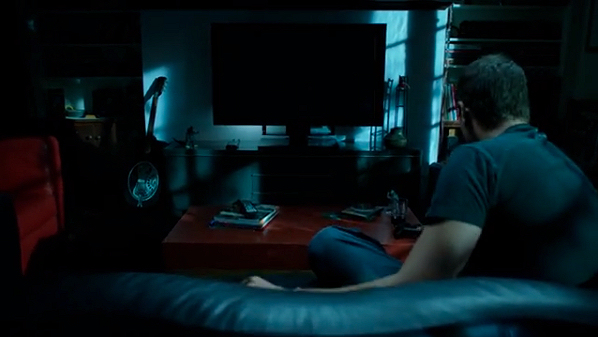
I had to work really hard to create moonlight this saturated. This was shot in Rec 709 mode to ProRes4444. There is no color correction.
Arri’s color is very clean and natural. While other manufacturers tend to enhance colors by making them more saturated or shifting them in interesting ways (see Canon, above) Arri just goes for accuracy. Their reds are a little off, but that seems to be an attempt to mimic film’s color response more closely. Otherwise, flesh tones are beautiful, blue skies are actually blue, and the color itself feels delicate like a watercolor painting. It’s everything that a film lover wants in a camera.

One of Alexa’s secrets is that colors only saturate to a certain point, beyond which point they only get brighter. Note that this gentleman’s flesh tone highlights aren’t overly saturated. They’re just as saturated as the rest of this face, just brighter.
Every camera is a film stock, and every company has a philosophy of color. These influence the images we capture, so it’s best to do some homework and understand what you’re getting into before a shoot. Not every camera is right for every job, and it’s the role of the cinematographer to choose the best tool for the needs of the project.
About the Author

Director of photography Art Adams knew he wanted to look through cameras for a living at the age of 12. After ten years in Hollywood working on feature films, TV series, commercials, music videos, visual effects and docs he returned to his native San Francisco Bay Area, where he currently shoots commercials and high-end corporate marketing and branding projects.
When Art isn’t shooting he consults on product design and marketing for a number of motion picture equipment manufacturers. His clients have included Sony, Arri, Canon, Tiffen, Schneider Optics, PRG, Cineo Lighting, Element Labs, Sound Devices and DSC Labs.
His writing has appeared in HD Video Pro, American Cinematographer, Australian Cinematographer, Camera Operator Magazine and ProVideo Coalition. He is a current member of the International Cinematographers Guild, and a past active member of the SOC and SMPTE. His website is at www.fearlesslooks.com. Find him on Twitter: @artadams.
