
Recently I shot some comparison tests between Sony’s older
SGamut color space and their brand new one, SGamut3.cine.
For several years I’ve been fascinated by camera color rendition. Every camera manufacturer, just like every film manufacturer, has their own look—their own way of interpreting and rendering color and contrast—that defines them and their products. I’ve spent a lot of time trying to figure out which choices are manufacturing-based (“We’re stuck with this because of how we built the camera!”) vs. artistic (“We think blues look better when they’re a little bit cyan!”). What I’ve learned is that there’s so much to learn I’m never going to learn all of it.
Still, I can learn some of it, and that’s why I shot these tests. I also have a vested interest in the results as I had a hand in developing the LUT through which these images were processed.
The current gold standard for digital color is the Arri Alexa. Arri has successfully transplanted the best characteristics of color film into a digital camera, and because the film aesthetic is such a strong cultural influence in the U.S. and Europe Sony has received a lot of requests to make their cameras appear more “filmic.” I’m sure that doesn’t thrill them, as they take great pride in their color science, but at the same time they are willing to listen to their customers and give us what we want.
Last year at NAB I had the chance to show some Sony engineers how an Arri Alexa saturates color versus how an F55 does it. (You can see that footage in this article, and I talk a bit more about the theory of what’s going on in this article.) The biggest difference I saw, beyond basic colorimetry, is that Alexa limits color saturation in highlights: when the luma portion of the video signal passes 40% or so (middle gray) the color saturation freezes in place: color only gets brighter, not more saturated. This is a big part of why film looks like film, and colorists have known for years that one of the tricks to making video “filmic” is to desaturate highlights.
“Can you create a LUT or look profile that does this?” I asked. The answer, apparently, was yes, because they did. It’s both an in-camera look profile (released with v3 of the F55 firmware) and a cube LUT for Resolve, among other applications. It’s called LC-709 Type A, and the “A” stands for either “Alexa emulation” or “Art Adams” depending on who you talk to at Sony. (I’m not literally looking for Sony to emulate Alexa; rather I’m asking them to make their cameras look more like film, and so far the only camera that comes close is Alexa so it’s the obvious example.)
You can download those LUTs here. There are four of them. The descriptions are:
SGamut3.cine/SLog3 to SLog2-709: Converts the image to Rec 709 color space from SGamut3.cine and translates the SLog3 gamma curve to SLog2. Presumably this is for those who prefer to grade using the SLog2 gamma curve but want SGamut3.cine color. (The SLog2 gamma curve emphasizes highlights while SLog3 is a bit more neutral and/or opens up the shadows. More on that in a coming article.)
SGamut3.cine/SLog3 to Cine + 709: This reproduces the look of shooting on color negative film and printing it onto film print stock. Print stock is inherently more contrasty than negative stock so this is an aggressive look that really crushes highlights and shadows. It’s quite interesting and I’m looking forward to giving it a try.
SGamut3.cine/SLog3 to LC-709: This is a low contrast and very pretty translation of SGamut3 to Rec 709 color space. It has a slight 2% lift to the blacks to allow full access to shadow detail in the grade.
SGamut3.cine/SLog3 to LC-709 Type A: This is the “filmic” version of the LC-709 look. Blacks are lifted to 5%, red is slightly different to match Alexa (I wasn’t told how they are different, but if I had to guess I’d say Alexa’s reds are a touch on the cool side and less saturated), the image is less saturated overall and the brighter highlights become the less saturated they are.
Note that I only tested Sony’s SGamut3.cine color space, and not SGamut3 itself. Full-on SGamut3 has not yet been released, although it will probably become available around NAB 2014. It encompasses a huge color space, close to that of human vision:
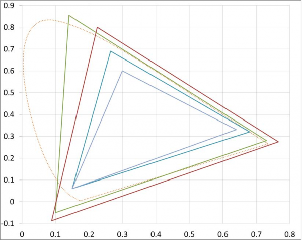
Legend: SGamut3 (green) SGamut3.cine (red) P3 (cyan) Rec 709 (blue)
The red dotted line is human color response.
As you can see, SGamut3 is HUGE. It’s meant to capture every hue the camera can see, in spite of the fact that there is no device that can currently display the entirety of the SGamut3 color space. It’s essentially the same gamut as Sony’s original SGamut, but SGamut3 renders colors differently. (We’ll see more of that in a bit.)
It’s important to remember that sensors have their own color spaces, and the way they see color doesn’t make any sense to a human. The building blocks of color — the analog signals produced by the red, green and blue photosites—can be assembled in an infinite number of ways. The software that assembles those photosites into pixels, and bends and shapes the hues into something recognizable and pleasing, is key. SGamut3 is a color space, yes—but it’s also helpful to think of it as software that interprets the abstract data that the sensor outputs as “color.”
SGamut and SGamut3 may encompass the same color space but SGamut3 is a significant advance in how the F55 reproduces color. Why? Software improves over time, and this is the latest and greatest software for the F55. The choices made when writing this software are based in both mathematics and artistry.
There are two flavors of SGamut3. SGamut3.cine is a much smaller, but much more user friendly, color gamut. It’s larger than P3, which is the largest color gamut in active use today (and likely to be for a while) and is much easier to grade down to Rec 709 (which is the spec that governs everything we see on a TV monitor). Like 4K (“We need the 4K’s!”) there are those who may think bigger is better. This is not necessarily true. Look how big SGamut3 is compared to Rec 709: every color captured in SGamut3 must be scaled to fit into Rec 709—or P3—to look decent on any modern display or projector, and while that can be done it takes an expert colorist to pull it off as well as a certain amount of time.
As an example, look at the diagram above and notice how much extra green there is in SGamut3 that has to be folded into Rec 709 without showing any obnoxious shifts in hue. Notice, also, that the captures captures much more saturated greens than red or blue. This means the scaling is not linear: you can’t just reduce the color saturation by 40% and expect everything to land in its proper place within Rec 709. Not only do red, green and blue need to be desaturated differently, they have to be remapped completely to different hues as the red, green and blue primaries are different between Rec 709, P3 and SGamut. (There is no objective red, green or blue color in light. Color scientists define those hues—which are RGB values—based on the needs of the reproduction system they are designing. Red is never 100% “red,” for example; there’s always a little blue and green mixed in as well.)
SGamut3.cine is meant to capture the same depth of color as a film scan, which is plenty for modern needs, and as it’s closer in size to both Rec 709 and P3 it’s much easier to grade.
Last year I shot a project for Canon to be used as part of their demo reel. I shot it in Canon raw and graded it in a DI suite. At some point I asked the colorist, “Are we grading in P3?”
“Oh no,” he said. “We rarely do that. There’s almost nothing in the real world saturated enough to take advantage of P3.” I certainly didn’t know that!
While the temptation to use full SGamut3 is probably overwhelming to some, it’s best to ask yourself (1) when will the extra color be displayable, (2) will your project still be marketable when that happens, (3) are you shooting anything that takes advantage of that color space, and (4) do you have the talents of a professional and expert colorist at your disposal. If not, SGamut3.cine is clearly the better choice. If your project has a long shelf life and would look great with rich saturated color then SGamut3 will protect all that, but you won’t be doing the Rec 709 or P3 grades yourself: you’ll need skilled professional help.
I shot my comparison tests in both SGamut/SLog2 and SGamut3.cine/SLog3. I used the exact same framing and exposure for both shots. My exposures were calculated strictly by light meter. I recorded to 4K XAVC, and for most of the shots I did no grading other than to pass the footage through either the SGamut/SLog2 LC-709 Type A or SGamut3/SLog3 LC-709 Type A LUTs.
Two notes:
The F55 and F5 use different color filter arrays, so even though these LUTs and MLUTs will be available for the F5 there will be differences. I don’t know what those are yet.
The LC-709 Type A MLUT in the F55 is currently not the same as what you’ll see here. The final SGamut3/SLog3 version of the LC-709 Type A LUT will be incorporated in v4 of the F55 firmware. The looks created here we done using the cube LUTs currently available through the Sony community website (see link above).
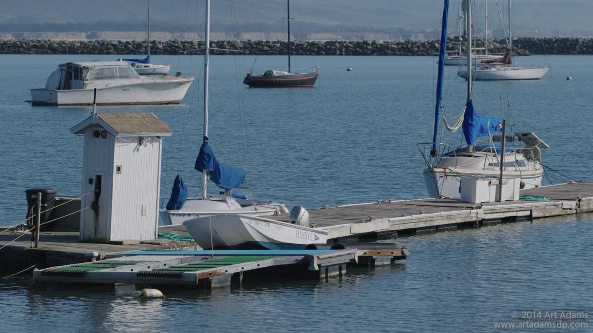
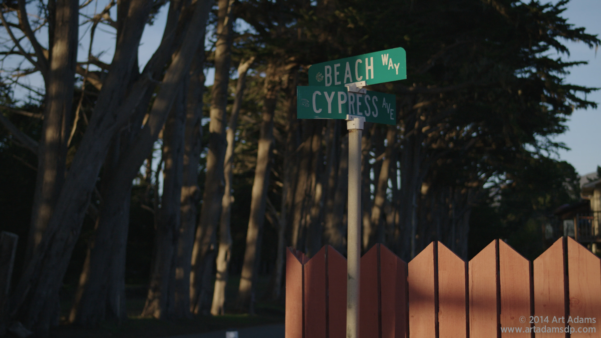
Let’s look at some pictures. I shot these at Princeton-by-the-Sea, near Half Moon Bay, California. (Special thanks are due to the Half Moon Bay Yacht Club, in particular Lisa the office manager, who allowed me to wander the property shooting pictures of brightly colored boats.) The first one in each set is always SGamut/SLog2 to LC-709 Type A, while the second is SGamut3/SLog3 to LC-709 Type A.

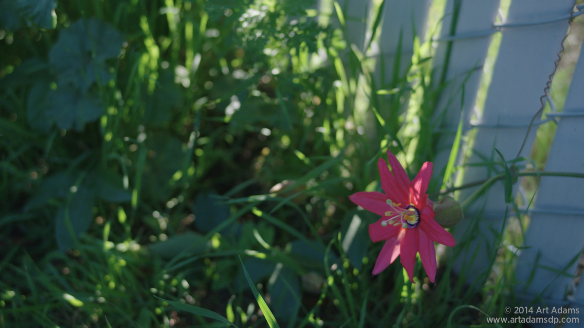
The bottom image (SGamut3.cine) is a little less contrasty, possibly due to SLog3’s emphasis on opening up shadows for grading.SGamut (top) greens feel very bright and artificial to me whereas SGamut3.cine greens are very delicate and painterly. The red flower is very rich in SGamut but feels a little fake to me. SGamut blue has a little green in it and looks a touch cyan, while SGamut3.cine blue is actually blue and feels a lot more natural to me.
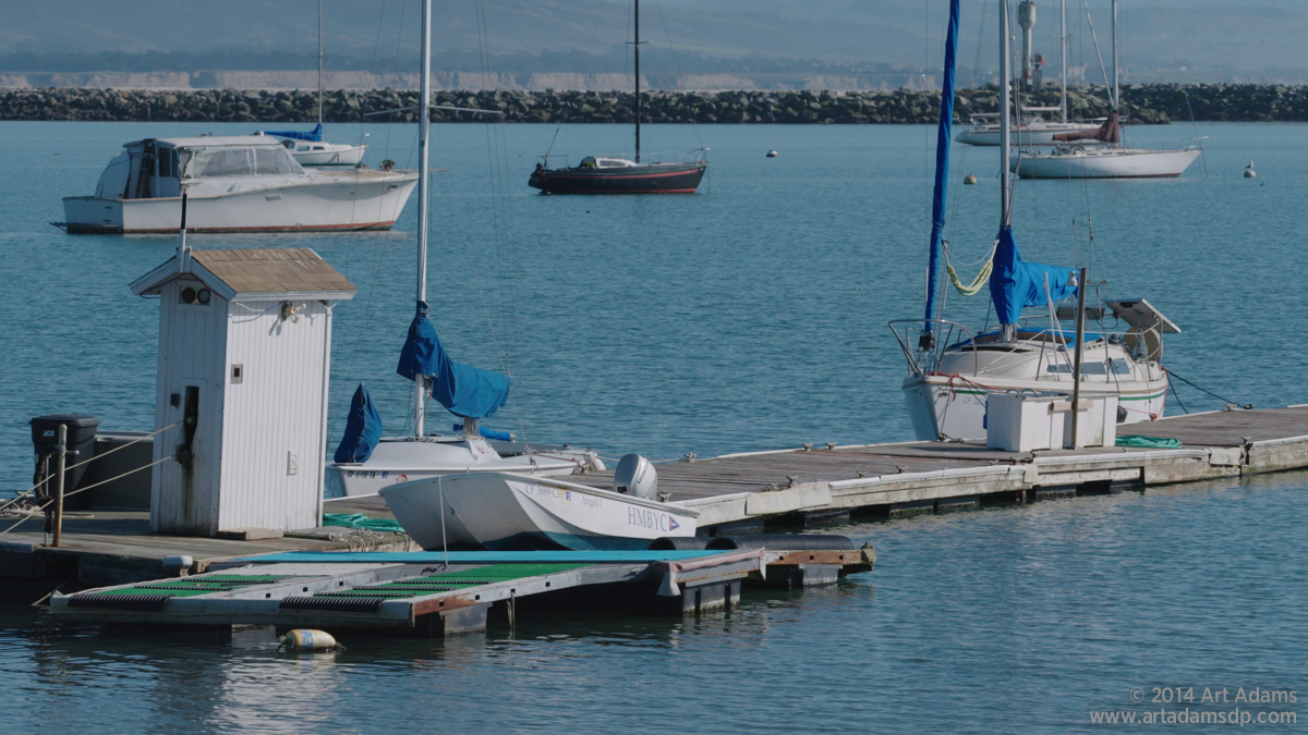
The blues in the SGamut image (top) are very bright and “video-like.” The water has too much green in it, making it cyan, which is pretty in the same way that candy tastes good but it doesn’t look right to my eye. The blues in the SGamut3 image are subtle and beautiful, like a painting. The water is no longer cyan, which is less dazzling but also less distracting as it now looks real to me and not artificial. The blue sail on frame right is a dark, rich blue instead of the electric blue in the top image.


The red boat in SGamut (top) is almost unbearably red, and the blues are rich beyond reality. The sky is cyan. The blue kayak, hidden behind the orange one, is almost painfully saturated.
In SGamut3.cine (bottom) the red boat is a much more believable color. The sky is now blue, which I like considerably more than cyan, and the other yellows, blues and oranges feel natural and not artificially enhanced.


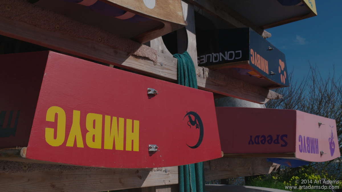
The yellow boats feel unnaturally bright and saturated in SGamut (top). They feel much more subtle and delicate in SGamut3.cine (bottom). The brown boat is also very saturated in the top image while feeling very painterly in the bottom image. Once again, blues are a little less electric, as are bright reds, and the sky is a pale watercolor blue instead of vibrant greenish-blue.


Once again, SGamut reds, yellow/greens and blues (top) feel over saturated and unrealistic to me. The yellow kayak seems to be skewing bright green. The SGamut3.cine colors feel much more natural and more like what I remember.
The SGamut red (top) is REALLY strong and distracting. The SGamut3 reds (bottom) are much more believable to me. SGamut really exaggerates reds, as we’ll see going forward. I like SGamut3’s subtle reds a lot more.
The SGamut3 sky is beautifully blue, and the flowers on the ground are pretty without being eye-popping. Note, also, that the SLog3 curve shadows are lifted a little compared to SLog2.
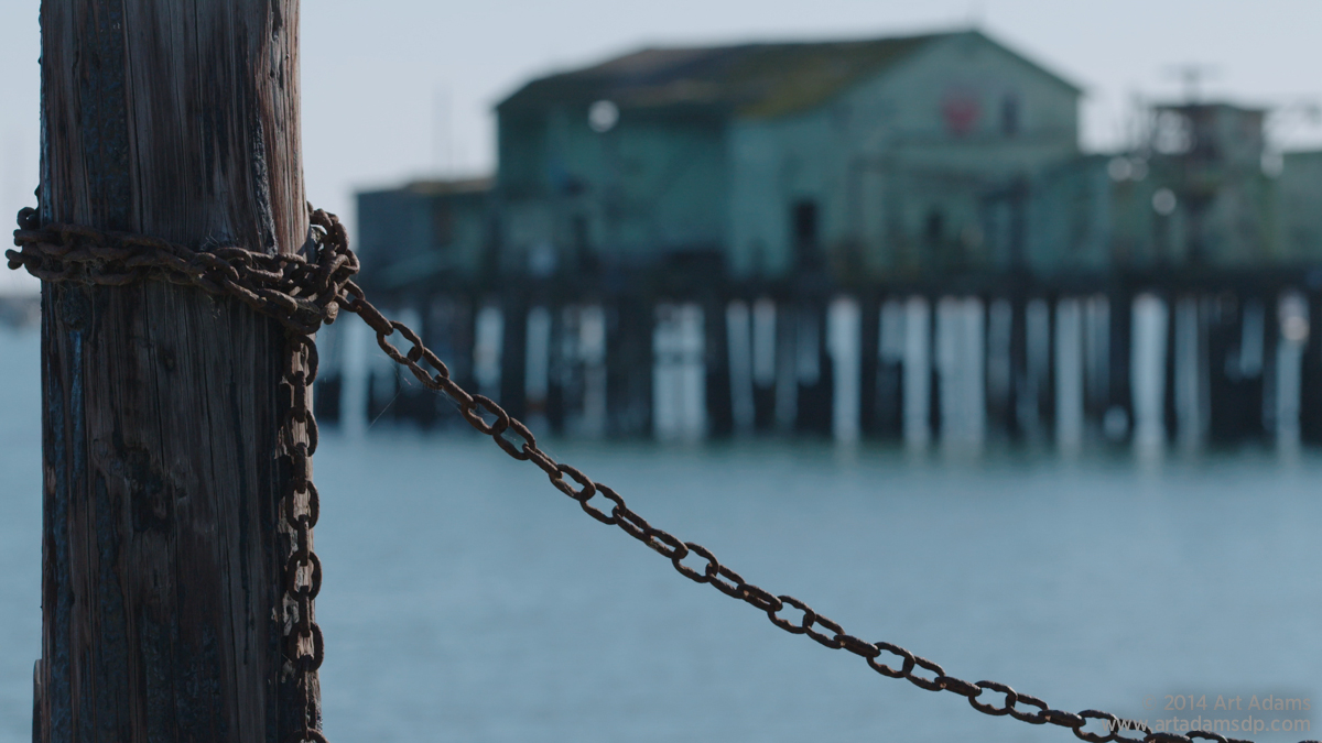

Once more, SGamut blue is really cyan, which is dazzling to the eye but feels a little false. The bottom SGamut3.cine image feels much more real and sophisticated to me: the building on the peer wasn’t blueish-green but a more muted yellow-green, which SGamut3.cine captures more accurately. (Note that the building is lit by blue skylight in this shot so it looks less yellow-green that it should. You’ll see it in sunlight shortly.)
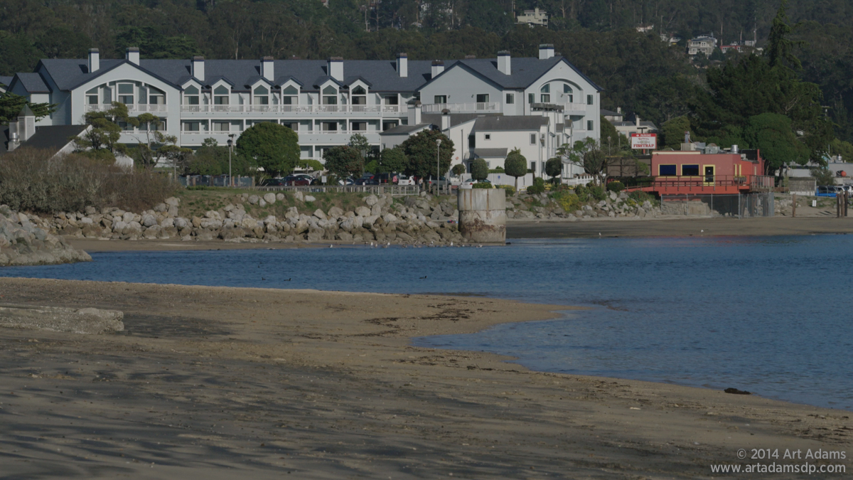
The orange house appears slightly too rich for my taste in SGamut, as does the yellow trim. The bottom SGamut3.cine image is more true to life and feels like a print from film negative instead of a slide transparency, as SGamut does.
The water is a beautiful subdued blue in SGamut3.cine instead of strangely Mediterranean in SGamut.
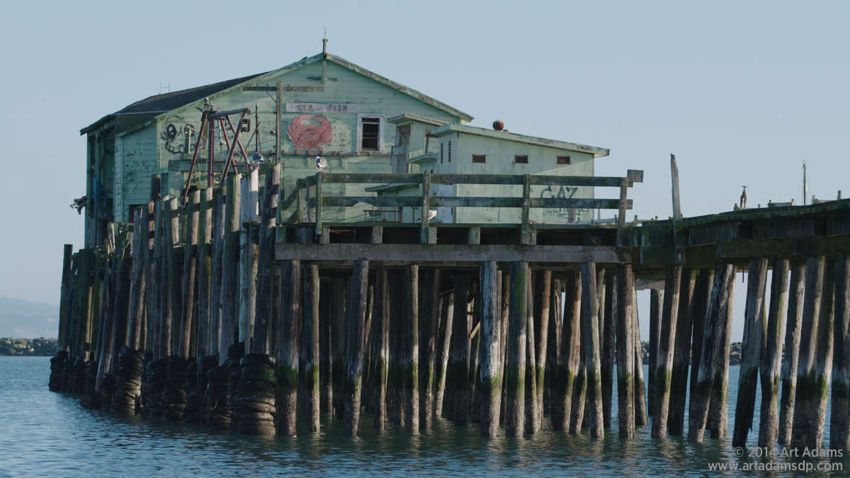
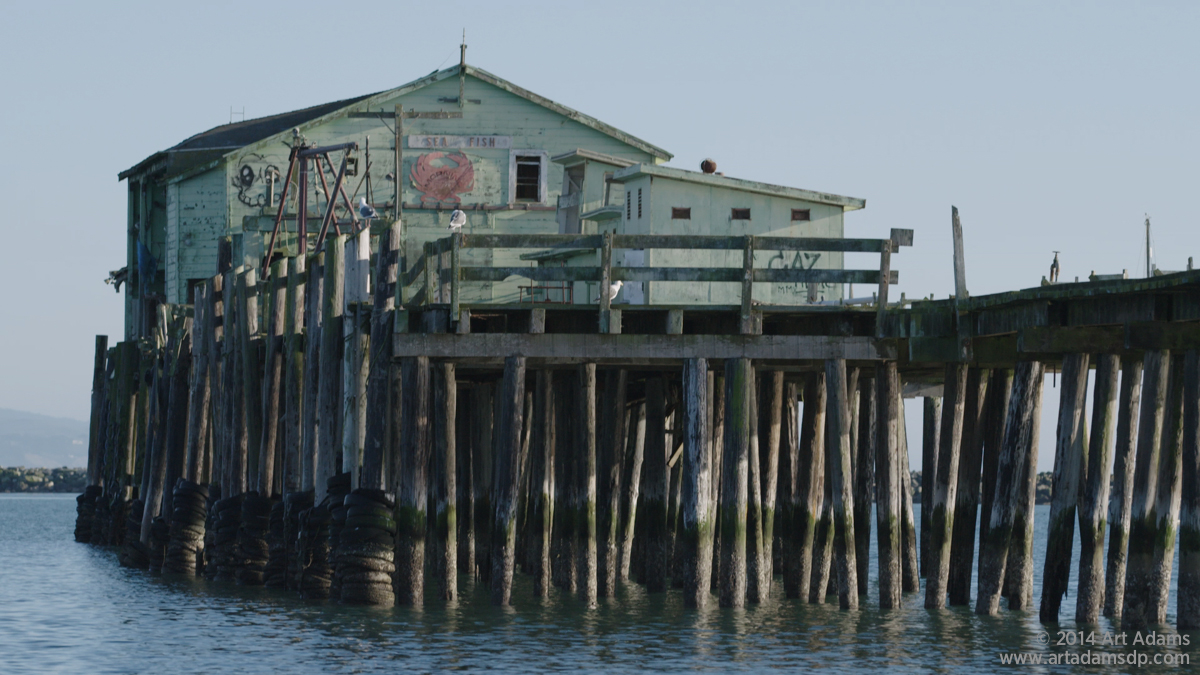
I decided to revisit this shot when the sun came around and lit the front of the building. Once again, SGamut’s blues are green whereas SGamut3.cine’s blues subtle and realistic. Note the slightly purple sky in SGamut3.cine, which is how it appeared lit by the warm setting sun.
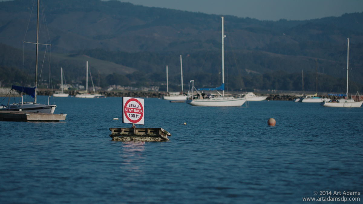
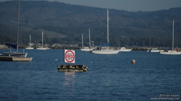
SGamut yields cyan water and a red sign that feels unnaturally red to me. SGamut3.cine shows beautifully blue water and a red sign that is much more true to what I actually saw, and what I’d expect to see outside of a music video.
Note, also, that the cyan haze in front of the hills in SGamut is now blue in SGamut3.cine, and the furled blue sail on the sailboat is much more subdued.
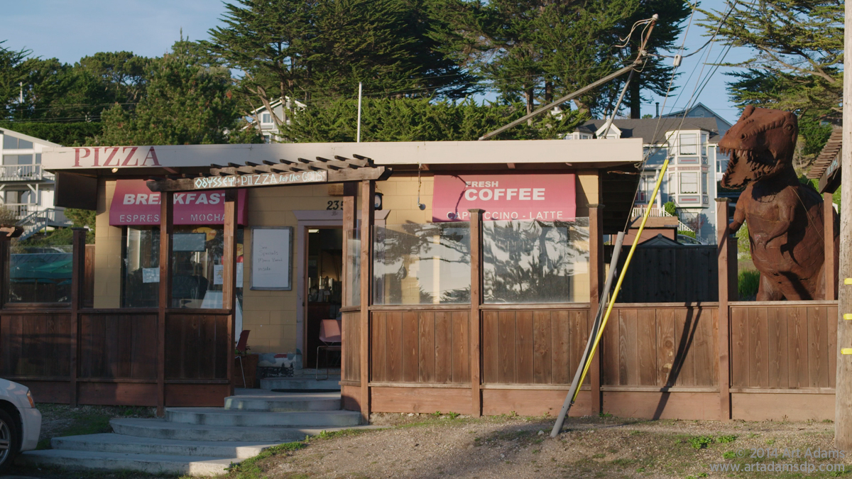
I shot this because the building colors seemed like they might be problematic for SGamut. What surprised me is how ruddy red the fence and the dinosaur appeared.
The SGamut3.cine image (bottom) feels a little desaturated but otherwise exhibits much more pleasing and accurate color. Even the slightly purple sky is appropriate as I shot this about one hour before a golden sunset.
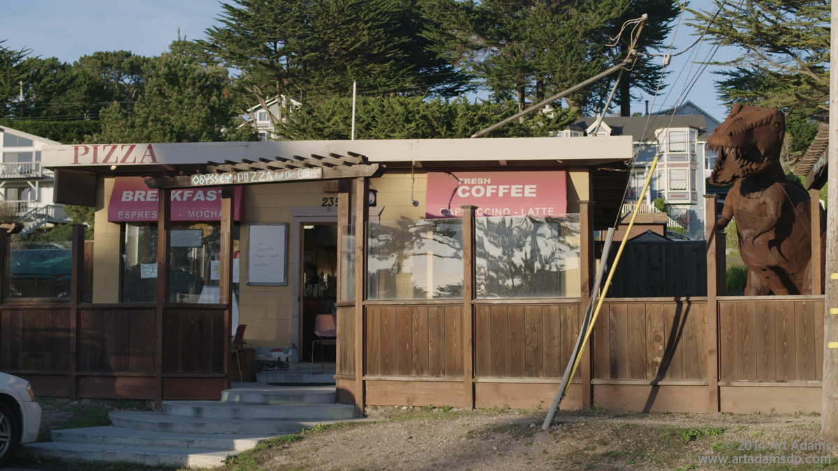
While the fence looked like SGamut (top) by eye, in the light of a golden sunset SGamut3.cine rendered it accurately (bottom).
The sky is actually blue in SGamut3.cine, which I much prefer over SGamut’s cyan. (For some reason SGamut’s cyan skies really bother me!)
SGamut (top) has way too much red in it. It looks artificially warm and golden as if it was pulled from a Thomas Kincade painting. (I’m not a Thomas Kincade fan.) SGamut3.cine (bottom) is warm and pretty and real, exactly the way I remember it.
The sand in the SGamut image looks magenta, almost like a knee artifact; I prefer the muted warmth of the SGamut3.cine sand below, which is how it looked by eye.
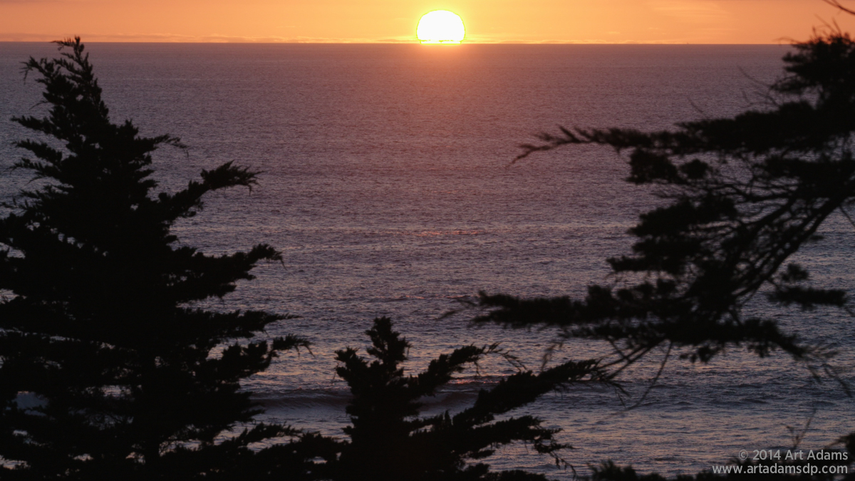

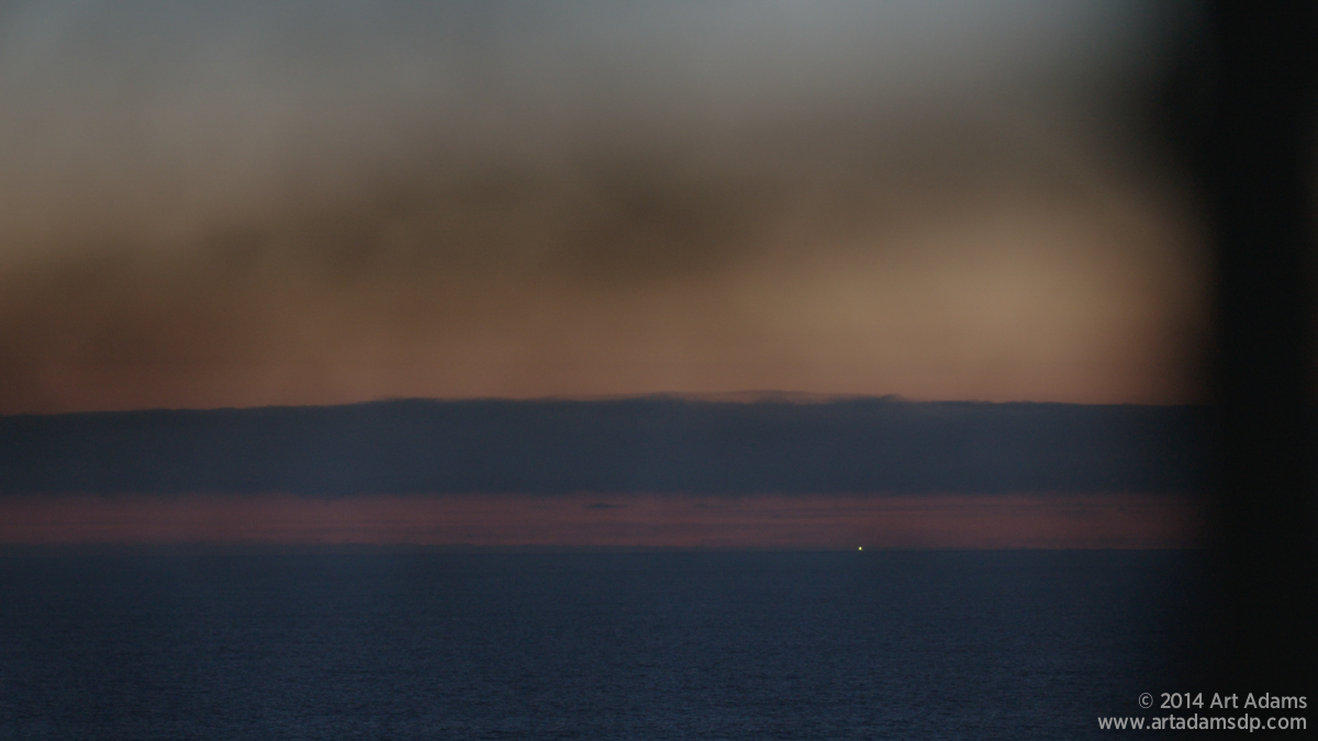
I’ve heard a lot of complaints about how hard it is to shoot sunsets with the F55 due to exaggerated yellows and reds. Indeed, the SGamut image at top looks as if the sun is surrounded by a yellow-green halo, and the image overall looks as if it’s being shot through a sunset grad filter. What I didn’t realize at the time I shot this image is that there is actually a hard crisp edge around the sun that looks like detail enhancement gone mad.
The SGamut3.cine image looks beautifully natural. If I want to make it look artificial I can always add a filter or change the grade later. The hard ring around the sun is gone, and its edges seem to blend into the sky organically.


The reds in the SGamut image are very saturated, making the air feel polluted to me. SGamut3.cine’s reds are delicate and sophisticated. They remind me of American landscape paintings from the 1800s.


I shot this with the camera in 3200K preset just to see what would happen. Once again, I much prefer blue water (SGamut3.cine) over cyan water (SGamut, top). SGamut distracts me with colors I don’t see in nature, whereas SGamut3 shows me the colors I expect to see, and does so beautifully and subtly.
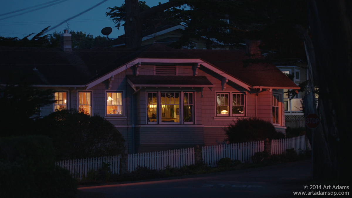

The bottom image has had some gain applied to chase the setting sun. What I like most about this is the quality of the tungsten light inside the house, through the windows on the left. The SGamut image (top) renders the interior as bright orange, whereas the SGamut3 image (bottom) makes it slightly warm and very delicate. DPs love this quality as it allows us to mix daylight and tungsten light without the tungsten light looking garish.
Here’s a closer look:
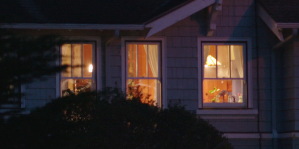
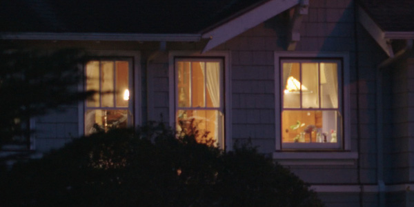
I much prefer how the camera renders tungsten light in SGamut3 (bottom).


The SGamut3.cine image (bottom) has had some gain applied to match it to the SGamut image (top) due to diminishing light. Both looks are appealing but I prefer the delicate hues of the bottom image. I can always punch them up later if I want more drama.
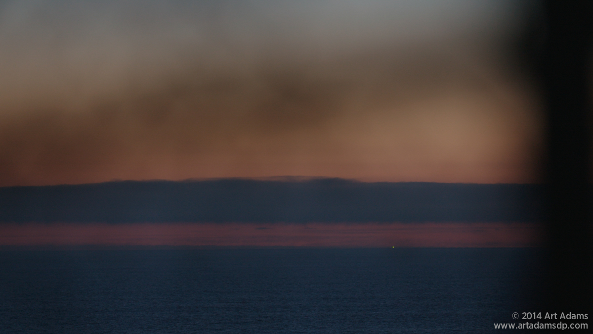
I added some gain to the lower image to match it to the top one. SGamut (top) is, once again, very red to the point where the air looks polluted. The SGamut3 image (bottom) is beautiful in its subtlety.
To me, SGamut3.cine is equivalent to a person telling me a fascinating story in a low voice in a quiet place, while SGamut is someone shouting their shoe size in a very small room. Loudness does not always make the content more interesting.
Adam Wilt will be showing off this very camera in the DSC Labs booth at NAB (C10215) this year. Stop by and say hi. We’ll be happy to show you different color spaces and gamma curves on charts that show very clearly what’s going on under the camera’s hood.
Disclosure: I have worked as a paid consultant to both Sony and DSC Labs. The camera and lenses used for these tests are on loan from Sony.
About the Author

Director of photography Art Adams knew he wanted to look through cameras for a living at the age of 12. After ten years in Hollywood working on feature films, TV series, commercials, music videos, visual effects and docs he returned to his native San Francisco Bay Area, where he currently shoots commercials and high-end corporate marketing and branding projects.
When Art isn’t shooting he consults on product design and marketing for a number of motion picture equipment manufacturers. His clients have included Sony, Arri, Canon, Tiffen, Schneider Optics, PRG, Cineo Lighting, Element Labs, Sound Devices and DSC Labs.
His writing has appeared in HD Video Pro, American Cinematographer, Australian Cinematographer, Camera Operator Magazine and ProVideo Coalition. He is a current member of the International Cinematographers Guild, and a past active member of the SOC and SMPTE. His website is at www.fearlesslooks.com. Find him on Twitter: @artadams.