
 Proper exposure in HD is not always easy. Meter readings don’t always match what the camera sees. Zebras tell us where highlights are clipped but that’s about it. False color gives us broad stroke references… but the most useful tool overall is the waveform monitor. The problem is that there are two kinds: both are extremely useful, but for completely different things.
Most people are familiar with the traditional luma waveform. If a camera or monitor has any waveform at all built into it, it’s usually this one. It shows scene brightness from left to right across the image, and there’s only one “trace,” or line, to worry about. This waveform is distinctly different from RGB parade, which shows traces for red, green and blue individually, usually in that order. (Some waveform monitors offer a different setup that displays colors in a slightly different order, green, blue and red, but these are rare.
Before we talk about the luma waveform let’s take a quick look at the Wikipedia entry on Rec 709:

Rec 709 is the set of specifications that defines the HDTV signal and establishes the standard that allows HD hardware and software to talk to each other. Built into it are a set of assumptions about what kind of data is important in an image: lightness is important, color considerably less so.
It has long been known that humans are much more sensitive to visual changes in lightness than in color, and television broadcast systems take advantage of this to decrease the amount of information they have to transmit. They preserve all the lightness information but remove a certain amount of the color as our brains generally won’t miss it. To further increase efficiency lightness and color are encoded separately, with the lightness signal itself calculated using the coefficients above.
If this is starting to sound a little geeky, hang with me. The basics are not that complicated.
Our brains determine how bright the world is by mixing a percentage of red, green and blue color into a lightness signal that tells us how bright things are, as opposed to how colorful things are. Green counts as around 70% of that signal, red about 20%, and blue is 10% or less. Luma, the lightness signal in HD, does the same thing: it takes a percentage of each color’s signal and blends it into one overall lightness signal. The proportions are the coefficients above.
Those coefficients add up to 1, so if we want to translate them into percent we just have to multiply them by 100: red is 21.26% of the lightness signal, green is 71.52%, and blue is 7.22%.
Is this really important? Yes, it is. Here’s why:
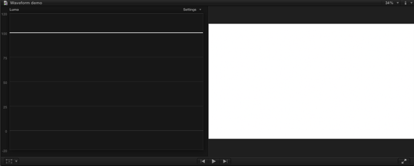
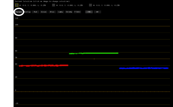
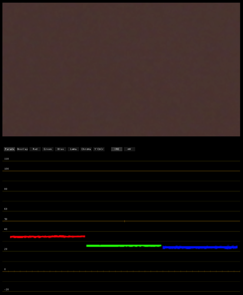
Here’s a white JPEG image I created in Photoshop by setting 8-bit color parameters to 255, 255, 255. The trace on the luma waveform, at the left of the image, shows that the image is perfectly exposed at 100%. Here’s what the same image looks like in RGB parade:
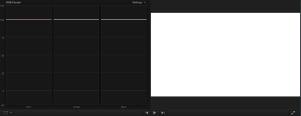
As you can see, each color channel is now split out on its own–red, green and blue–and they are all pegged at 100%. Let’s shake things up a bit and separate the colors:
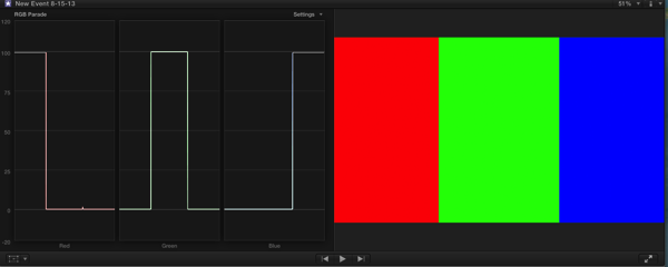
I’ve now created three patches of pure color. The RGB parade waveform shows how strong each color signal is in its own channel, and each one is pegged at 100% where it appears in its channel. The channel shows red at 100% where the red patch appears, but zero where the green and blue patches appear, etc.
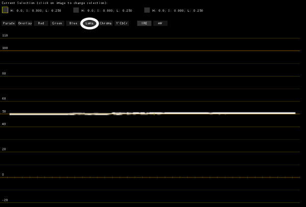
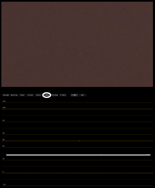
Now is where the fun starts. Let’s look at the luma waveform of the same image:
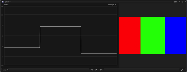
None of the color patches are pegged at 100% anymore. In fact, they’re kind of all over the place. What’s going on? Well, look at the Wikipedia entry again:

And then look at this:
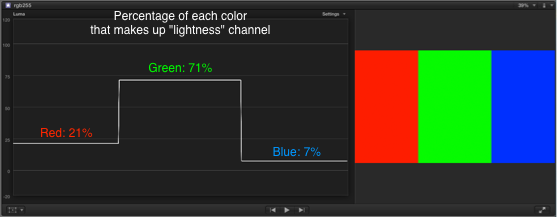
What I’m trying to show is this: if you are looking at a luma waveform, the simplest and most common waveform format, you’ll never see a really pure color hit 100%. It can’t. The purest green ever can only hit 71% on a luma waveform monitor. That’s just the way the system–both human and HD–works.
The good news is that you’ll never see a color this pure in the real world, so this shouldn’t be an issue. Most everything you’ll see in an image, even colors that appear to be pure, will nearly always be a combination of other colors as well. The purest green screen in the world still reflects some blue and red; the purest blue screen in the world reflects a lot of red and green.
I used to insist on looking at RGB parade all the time but I’m changing my view on that. The main reason for this is that the luma waveform really is a digital spot meter that looks only at lightness and almost nothing else. It’s a little insensitive to saturated colors, but so are spot meters. (Light meters are designed for peak response at around 550-600nm, or the green part of the spectrum. Reading saturated blue or red light with an incident meter or a red or blue object with a spot meter may result in an exposure error of one stop or more.)
RGB parade doesn’t really show you the video signal, but rather shows you an interpretation of the video signal: it’s basically the three color channels broken out into code values, which gives you a combination of color and lightness information but not in a way that tells you what the actual exposure is.
Make sense? Probably not. Let’s fix that:
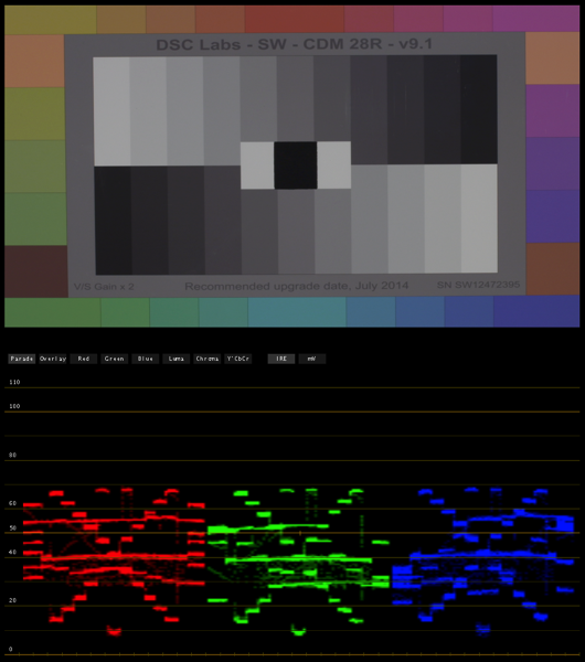
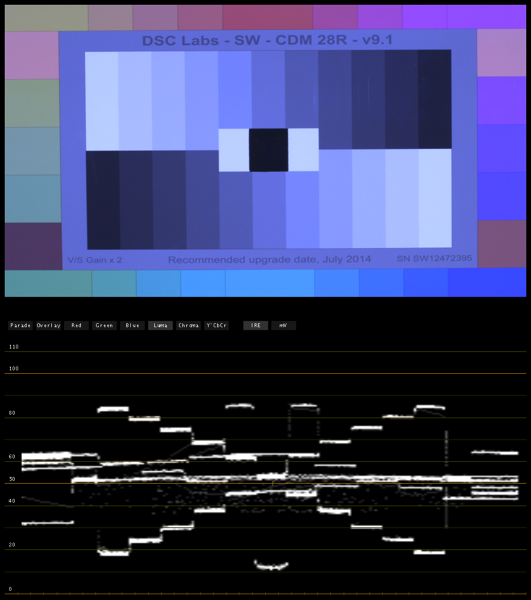
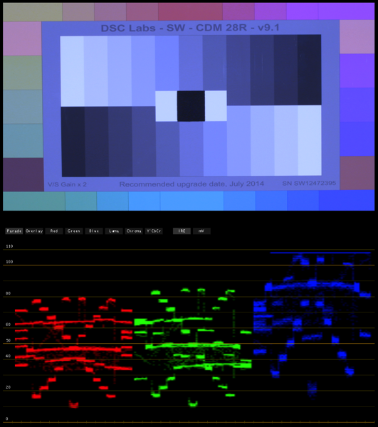
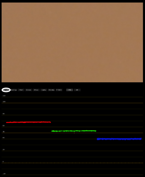
Here’s a DSC Labs Chroma du Monde chart with its RGB parade waveform captured in Apple Color. The chart is exposed to put middle gray at 40%, which is where 18% gray falls in Rec 709. (It’s actually 41.7%, but I round off for simplicity.) As you can see, each channel has similarities but also differences: the “X” of the grayscale ramp looks the same in each, but the horizontal lines that represent the color chips fall in different places depending on the color channel. What RGB parade is showing us here that you can’t see in luma is that the image is white balanced: the neutral tones–white, black and gray–all fall at the same levels in each channel.
If I skew the white balance toward green, this happens:
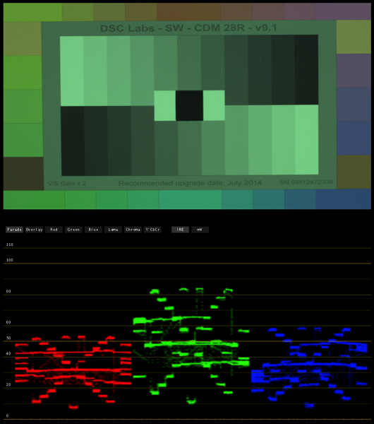
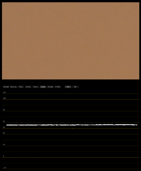
It’s easy to see that all of the neutral colors are now excessively green. White balancing the camera will bring all the peaks into alignment, or if you’re white balancing in post it’s easy to push the wheels around until the highlights, mid tones and blacks line up. The luma waveform is less helpful in this regard:
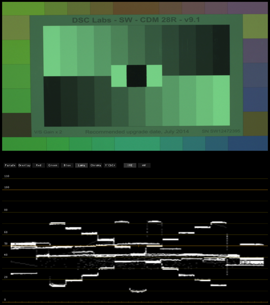
This waveform gives us brightness information for every part of the image, but no information about color.
There’s another time when parade RGB comes in handy: if we want to see if a particular channel is clipped:
This image looks pretty blue, but it should be okay because nothing is clipping, right? Wrong:
The blue channel is definitely clipped, but since blue is only 7% of the lightness signal we may not see it on the luma waveform. In parade RGB, though, it’s really obvious as to what’s going on.
I got used to using RGB parade for everything as this kind of information is really useful, but it can be tough setting consistent exposure on flesh tone and objects because the balance of these channels changes depending on the object color. How do I expose dark skin vs. light skin in parade RGB? How do I expose a bright red shirt vs. a light blue shirt? All of these things will look dramatically different on a RGB parade waveform, but not so much on a luma-only waveform.
A good example of a situation where we’re only looking at one color or another is green screen and blue screen. As the Chroma Du Monde chart shows us primaries that aren’t completely pure (because the Rec 709 primaries aren’t pure colors to begin with) I’m going to zoom into patches on the chart to illustrate this point. Here’s the blue patch in parade RGB:
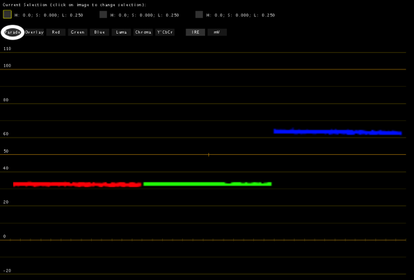
In RGB parade blue is up at around 63-64%, while red and green are down at about 32%.
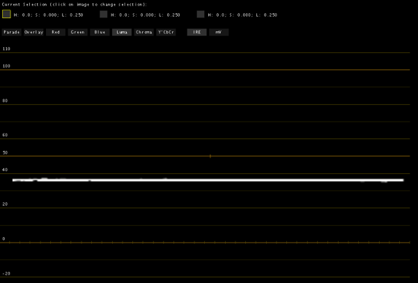
The luma only waveform shows the blue patch at about 38%. The rule of thumb, left over from the film world, is to expose blue no brighter than about 18% gray, so we’re only 2% short of that here. (In film you can only capture a saturated blue or a light blue but not both at the same time, so exposing blue at 18% reflectance gives you the best combination of lightness and saturation without sacrificing either.) Both of these waveforms are important but in different ways:
The luma waveform shows us how bright the blue is, for exposure purposes. There’s no such thing as a perfect blue screen so exposing it at around 40% doesn’t really hurt us here, even though a good part of this exposure information is driven by the fact that there’s additional red and green mixed into the blue, as there is in any image. As we saw above, if this was the purest possible blue then this line would be pegged at 7%, as a perfectly saturated blue will never be very bright either to a Rec 709 camera or our eye.
A common trick to increase saturation in blue screens is to light them with tungsten lights covered in blue gel, or balance the camera for tungsten light and illuminate the screen with uncorrected HMIs or daylight blue Kino Flo tubes. This will make a blue screen look more saturated in RGB parade, where red and green will drop away from blue, but the luma waveform may show the overall exposure as being much less.
The RGB parade waveform shows us color channel separation, which is crucial in blue screen work. The rule of thumb used to be that you wanted to see at least 40 units of separation between blue and the other channels for a good key, but standards have loosened enough that the 30% we see here between blue and the other colors is plenty.
In other words, luma shows us overall exposure and parade RGB shows us purity and separation. Notice that the green channel in parade RGB, from which most of the lightness information is derived, is always within about 5% of where the luma waveform falls, because green provides 70% of the lightness information.
I used blue screen as an example because it’s a dramatic one, but blue screen is effectively dead with the advent of Bayer pattern sensors as blue channel resolution is only half what you’d see in the green channel.
Here’s the green chip shown in RGB parade. It’s sitting at about 60%, with about 20% separation between red and green. Here’s the luma waveform:
It’s basically the average of all the channels. With red and blue around 40% and green at 60%, the luma signal comes in at 50%. That’s a good spot for green screen: we tend not to expose it darker than 40% luma, and the addition of some green gel to the lights hitting the screen will drop the red and blue channels down significantly and make the green more pure.
Let’s look at a couple of flesh tone examples:
Here’s typical caucasian flesh tone. Note how green is near 52%, while red is a bit higher and blue is almost equally lower. The luma waveform looks like this:
The luma trace looks to be around 55%, which is almost exactly what Arri recommends for flesh tone in Alexa’s false color mode (52-55%). There’s a lot of green in flesh tone, which is why the green in RGB parade and luma match so closely.
This flesh tone is darker and the color balance is a bit different. Green is at around 25% in parade RGB.
The luma waveform puts lightness at around 28%.
To sum up, I used to like RGB parade for everything but now I like it for only three reasons: it’s a quick way to judge color separation in green and blue screens, I can quickly see if I’m clipping a color’s saturation even if I’m not clipping its exposure, and I can look at a neutral color and see if the camera is white balanced.
I like luma for everything else: it’s a great way to quickly dial in an exposure on colored objects because it gives you one composite lightness value, instead of showing you different values based on color saturation that may or may not influence how bright an object really looks.
Ideally I’d have a monitor that showed me luma and RGB parade waveforms at the same time. Ikan has monitors that do this but as of June 2013 the math driving their waveform monitors appears to be wrong, so the scopes aren’t accurate enough for professional use. My hope is that the Convergent Design Odyssey 7 will give me this capability with more accuracy, although that’ll take some testing to find out for sure.
The nice thing is that the price of having a lot of color and exposure information at the camera is no longer the $5,000-10,000 that companies like Leader and Tektronix charge for their equipment, but a much more affordable $1,000-1,500. In the good old days when we had to get the look right on set producers would happily pay for such high end tools, but these days with raw and log and dwindling budgets this happens a lot less. Fortunately these prices make it possible for a DP or DIT to buy their own scope, just as they would a light meter.
Disclosure: I have worked as a paid consultant to DSC Labs.
About the Author

Director of photography Art Adams knew he wanted to look through cameras for a living at the age of 12. After spending his teenage years shooting short films on 8mm film he ventured to Los Angeles where he earned a degree in film production and then worked on feature films, TV series, commercials and music videos as a camera assistant, operator, and DP.
Art now lives in his native San Francisco Bay Area where he shoots commercials, visual effects, virals, web banners, mobile, interactive and special venue projects. He is a regular consultant to, and trainer for, DSC Labs, and has periodically consulted for Sony, Arri, Element Labs, PRG, Aastro and Cineo Lighting. His writing has appeared in HD Video Pro, American Cinematographer, Australian Cinematographer, Camera Operator Magazine and ProVideo Coalition. He is a current member of SMPTE and the International Cinematographers Guild, and a past active member of the SOC.
Art Adams
Director of Photography
www.artadamsdp.com
Twitter: @artadams